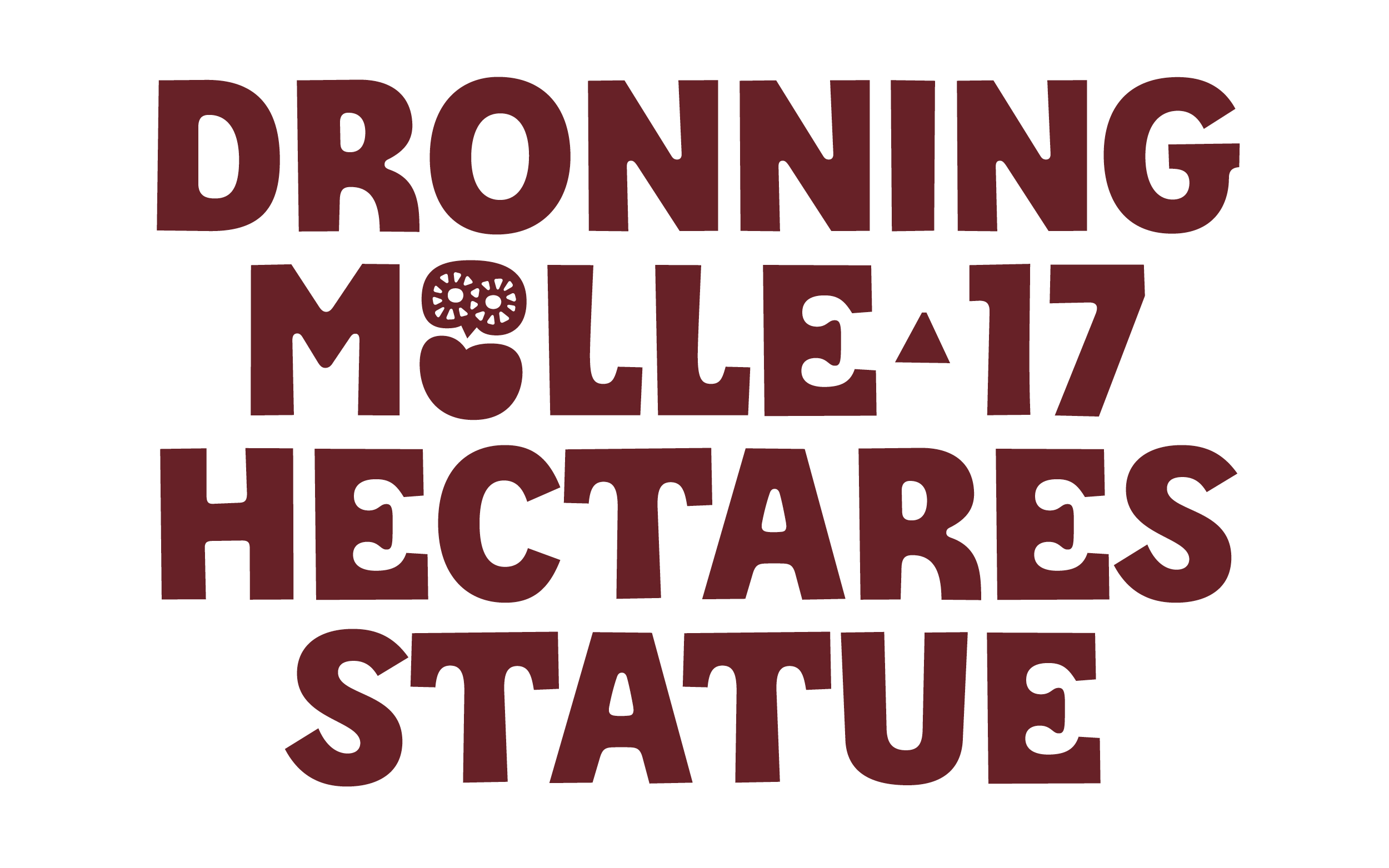
Tegner was inspired by a visit to the Museum of Rudolph Tegner. It is located in the north of Zealand, Denmark and said to be one of the oldest and rather radical concrete buildings in Europe.
A poster from an exhibition at the Independent Artspace Den Frie in Copenhagen from 1911 featured very special letters that resonated with the roughness of the museum building.
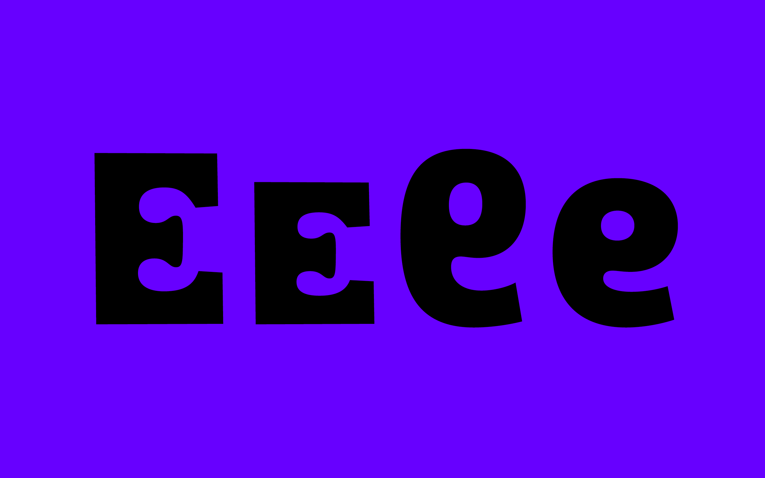
Square on the outside and organic on the inside, the forms follow their very own unlogical approach.

Tegner is not very usable for longer texts, but who knows where it will be used. The tight text image, filled space characters and dancing unicase letters leave a rather lively impression.
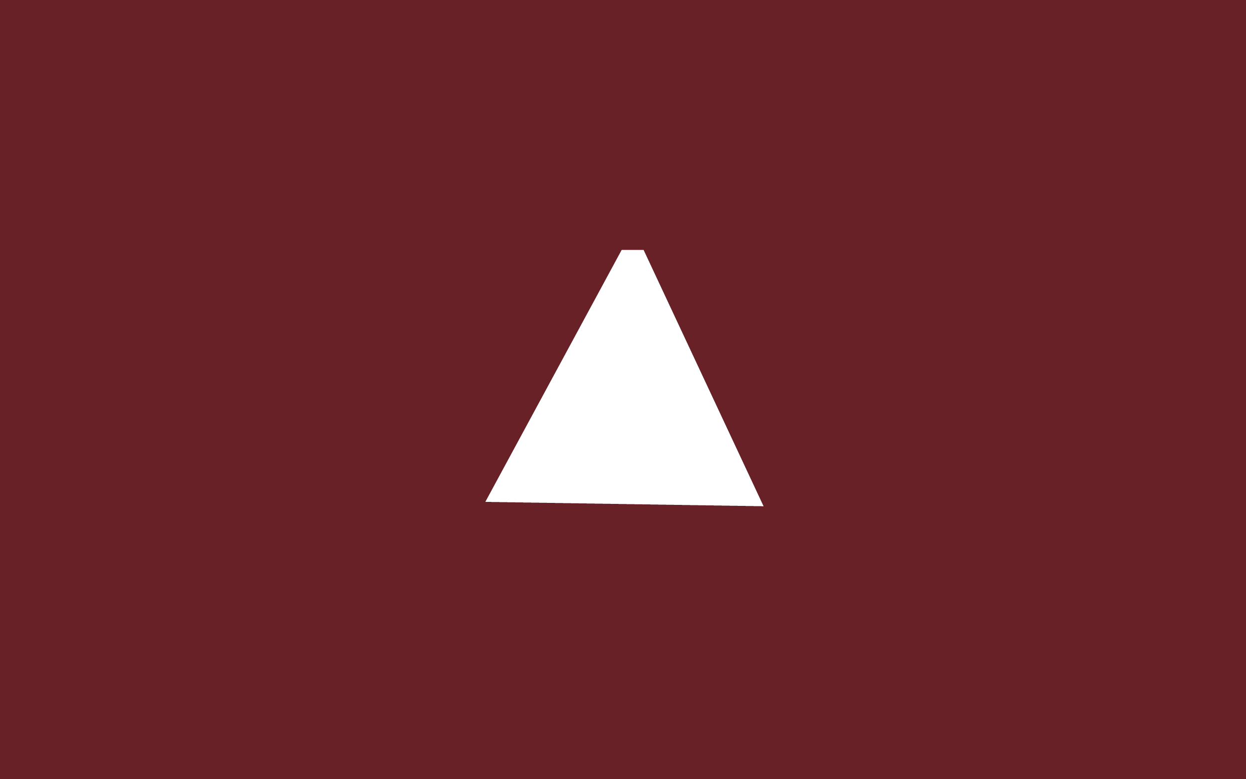
We do not pay attention to them, because they are somewhat invisible: the space characters. For Tegner the default version has a form. There might be more different ones in the future. Take care to set text in Indesign with the World-Ready-Composer to avoid this triangle to pop up in the background of the ligature.
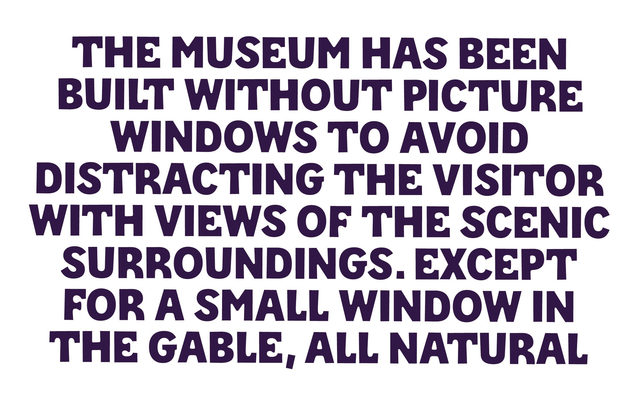
The space character can be exchanged to make text more readable. And Tegner might be one of the typefaces where I would actually recommend All-Caps setting for better readability.
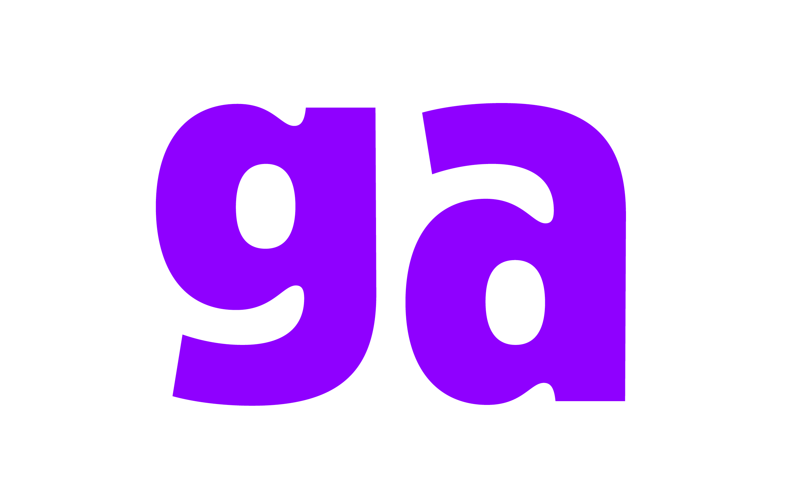
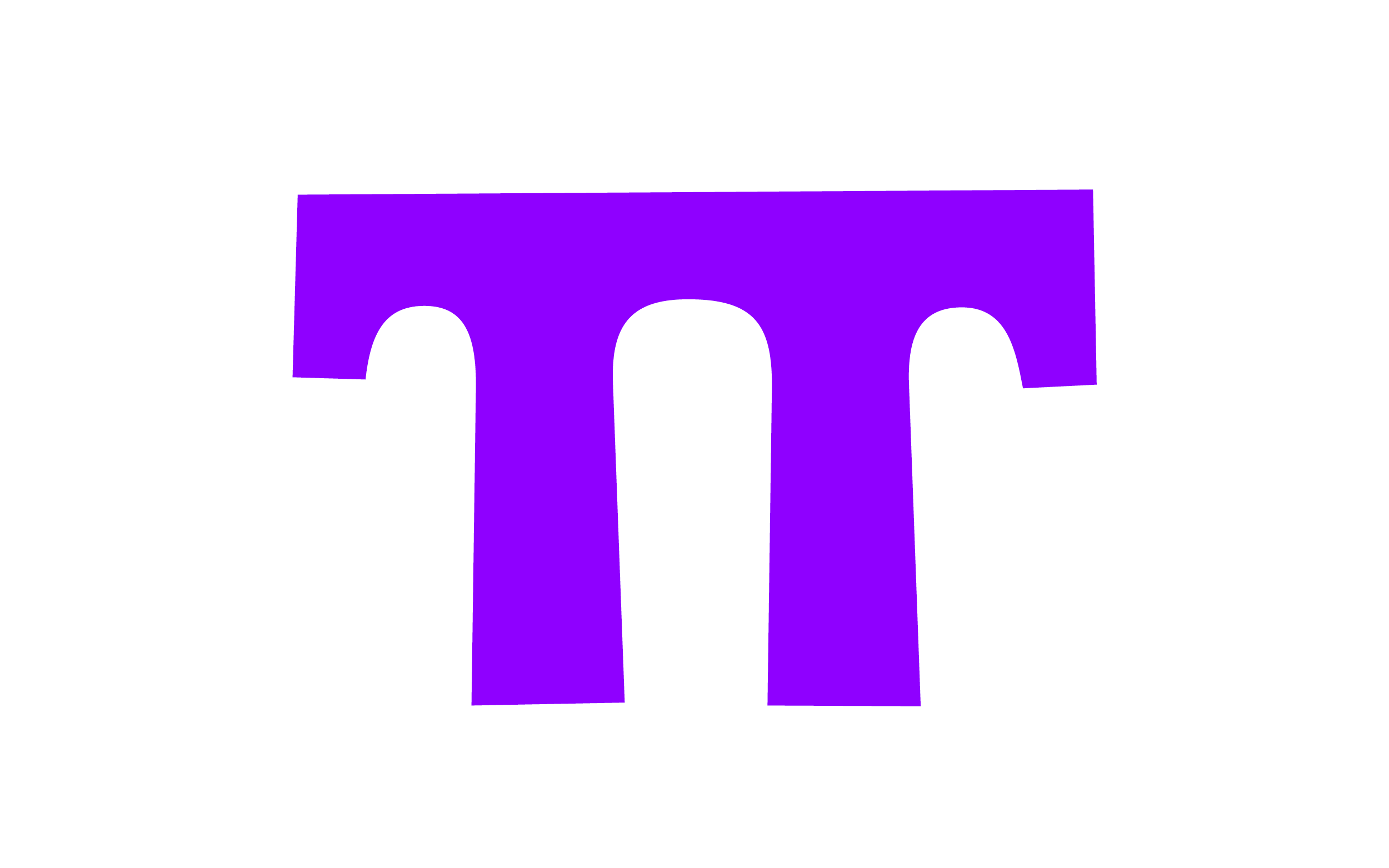
New processes, like drawing unicase come with surprises. The a and g forms are the same, flipped.
By adding accented characters a whole set of both small uppercases and small lowercases made it to the otherwise unicase set.
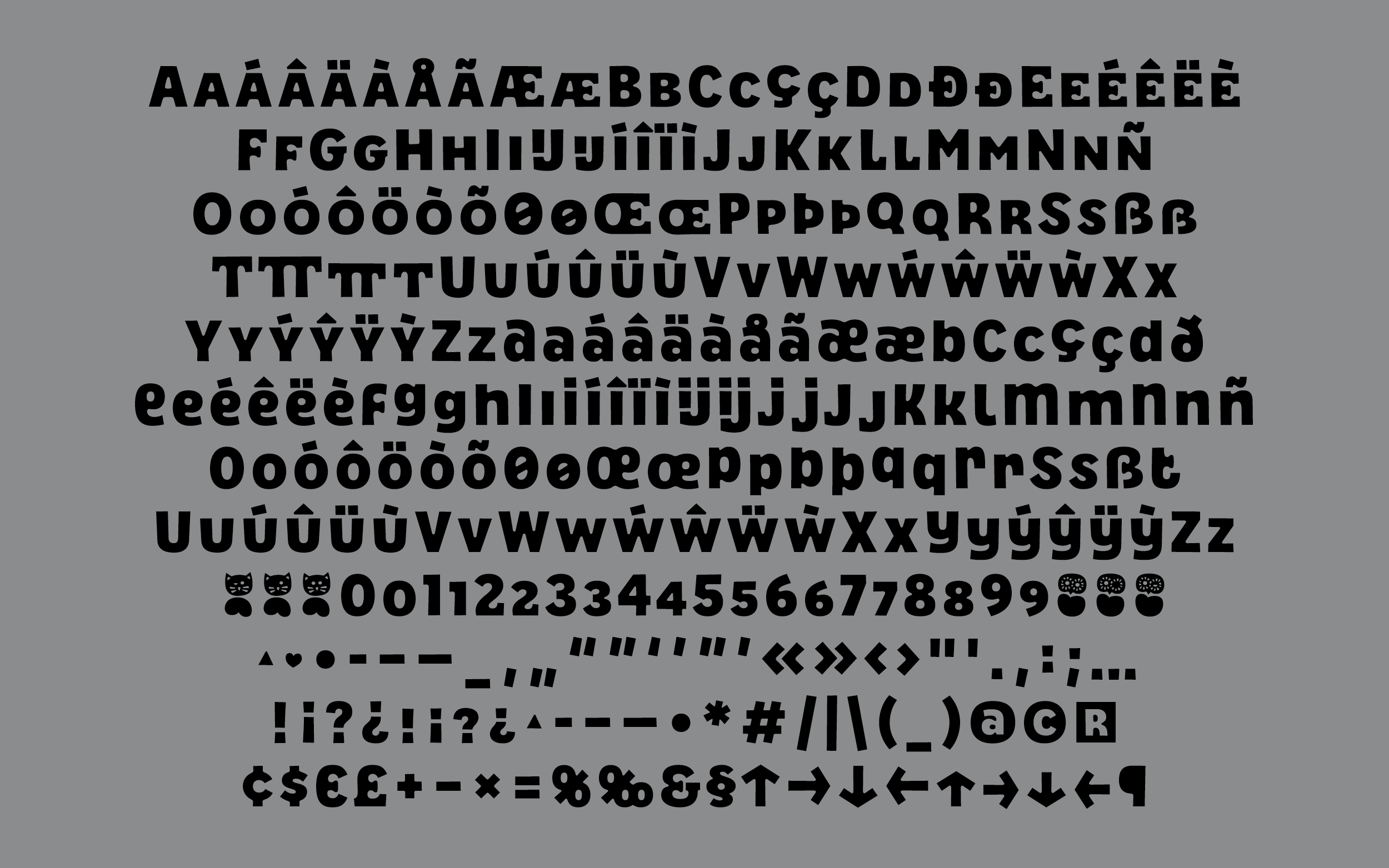
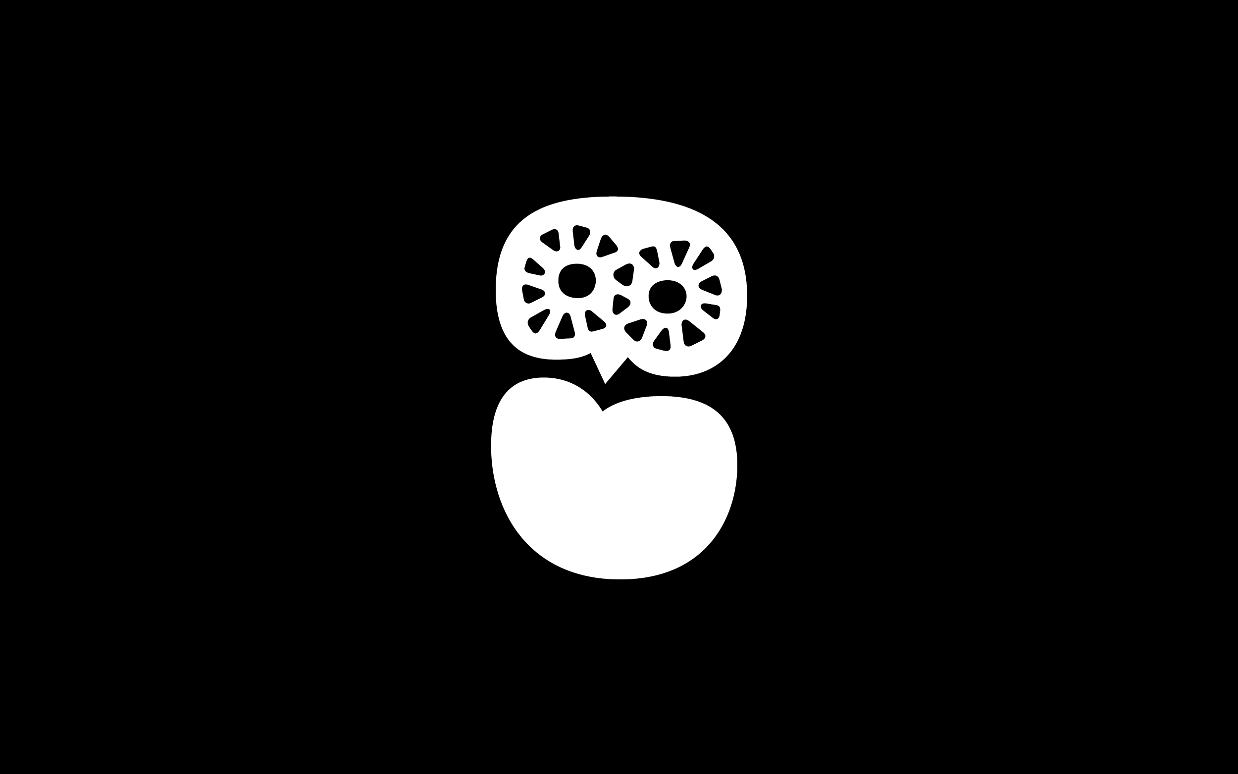
The scope is covering central European languages for now. Currency signs and other additional characters were added upon customer request. The space character got an alternate too, a heart shape. And the current .notdef has multiple stylistic sets, right now it's the cat.
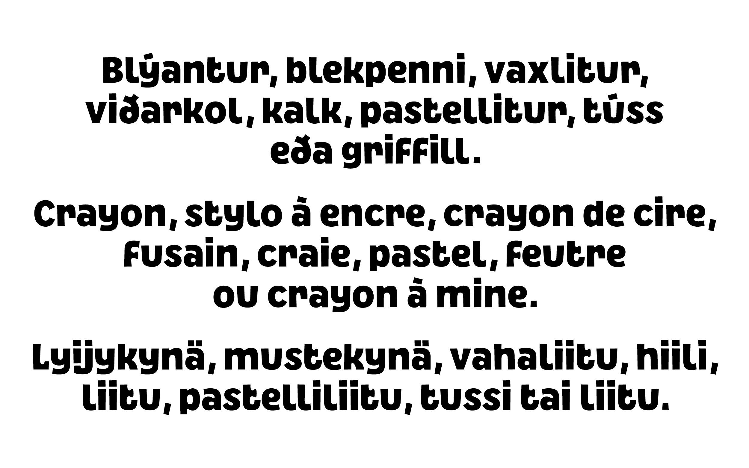
Some icelandic, french and finnish drawing tools.
As always, big thanks to FutureFonts, the most awesome platform and team for processes and projects that can be their true and organic growing self. It's so much fun.
Tegner
Retail typeface on FutureFonts
Published 2024 / Updates ongoing