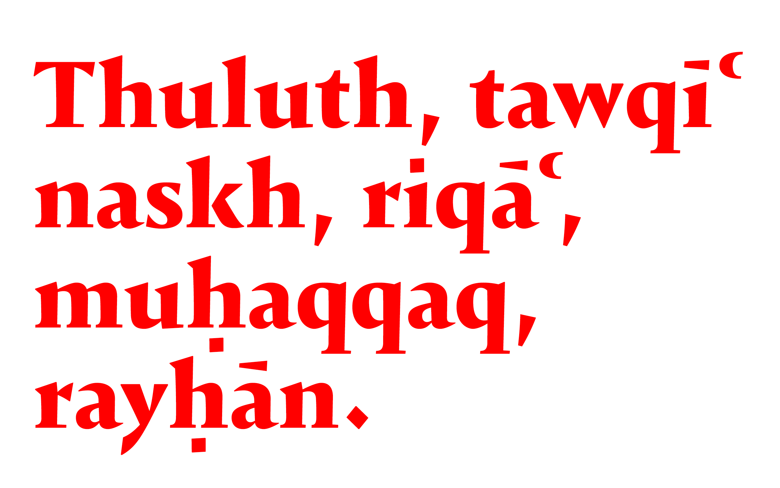
Known as the "Six Pens" these styles were defined by Ibn Muqla with the aim of standardizing Islamic calligraphy. The styles were formally described and defined in their proportions. Naskh, one of these styles, serves as a simpler workhorse for longer reading text, and is the basic arabic style of this project.
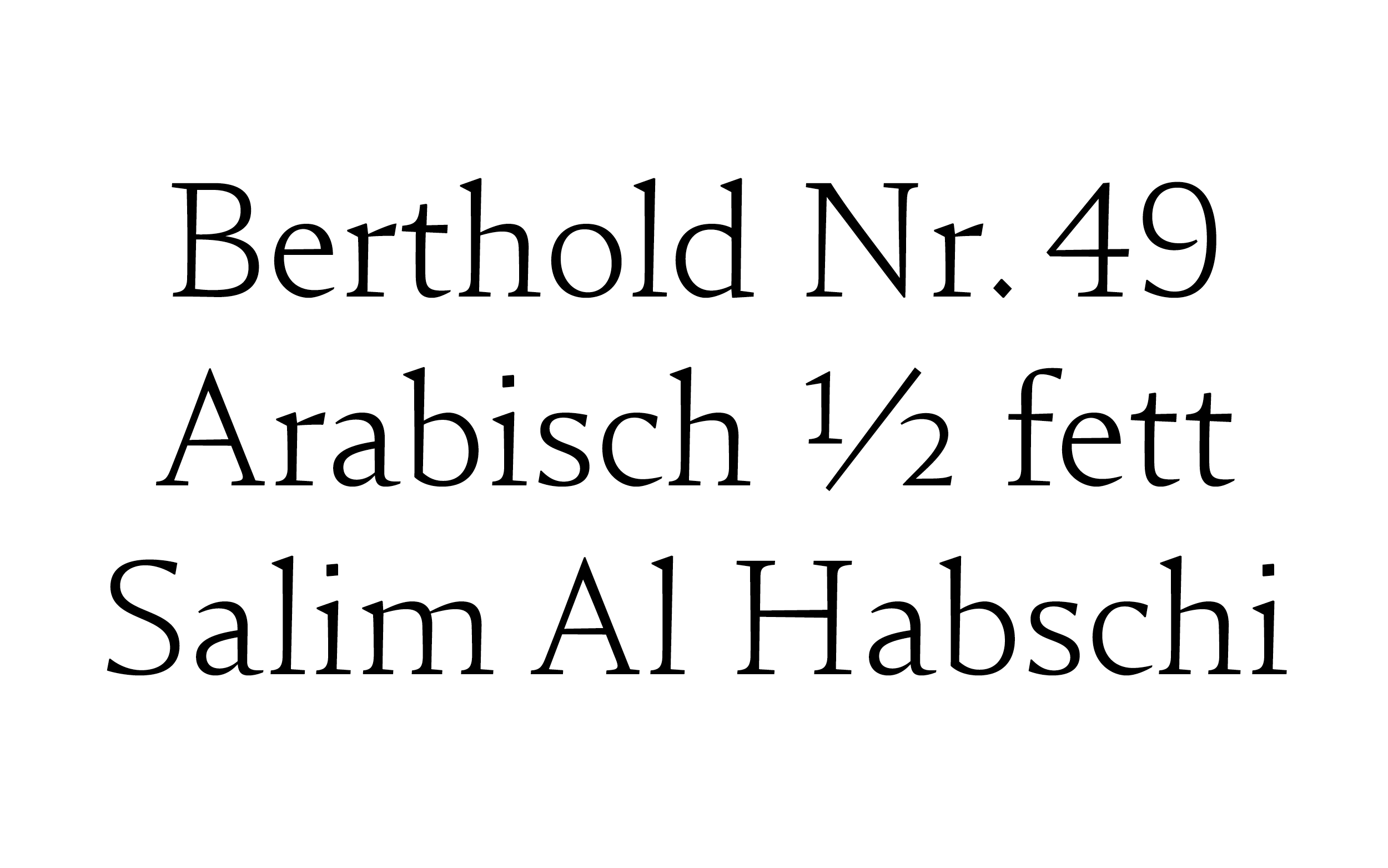
Pascal Zoghbi discovered an unrevived Naskh in the archives, back in the days sold under the name Berthold Arabisch Halbfett Nr. 49 originally drawn by the egyptian surrealist artist Salim Al Habschi. If you want to dive deeper into this wicked research journey, this is a really interesting talk.
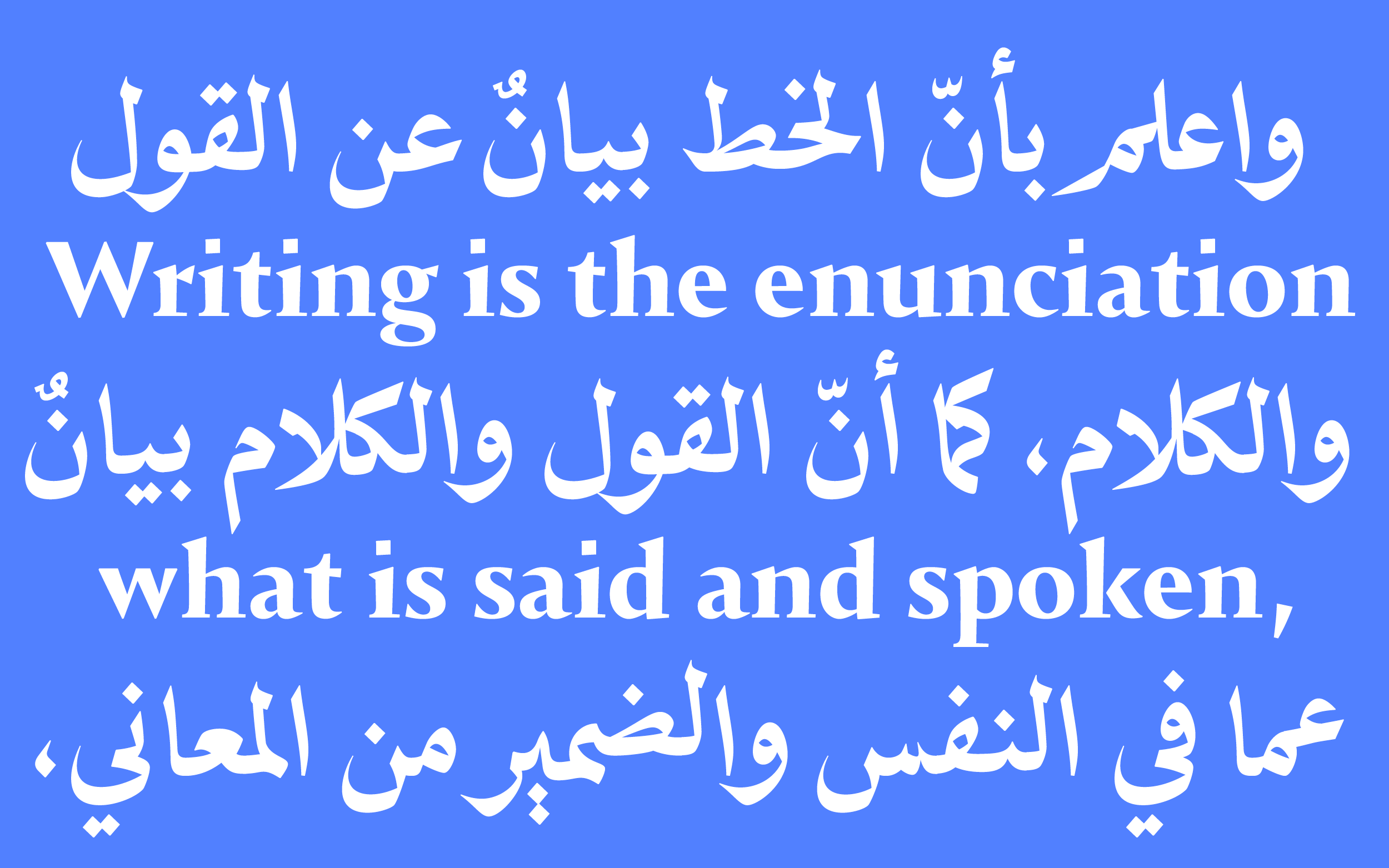
While reviving the design, he had to address questions related to both the sources and calligraphic traditions. My task was different: to find a true companion that is both expressive and pleasant to read.
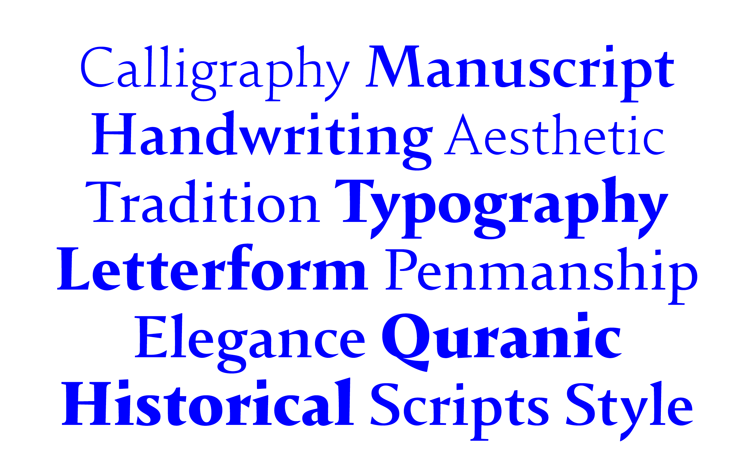
While staying true to the Latin tradition and echoing the calligraphic base, Idris Sharp led the design process to create a contemporary solution. The stems became lively, slightly flaring towards the top, and the fluidly changing contrast was incorporated. Some endings were straightened and became triangular, while others were simplified.
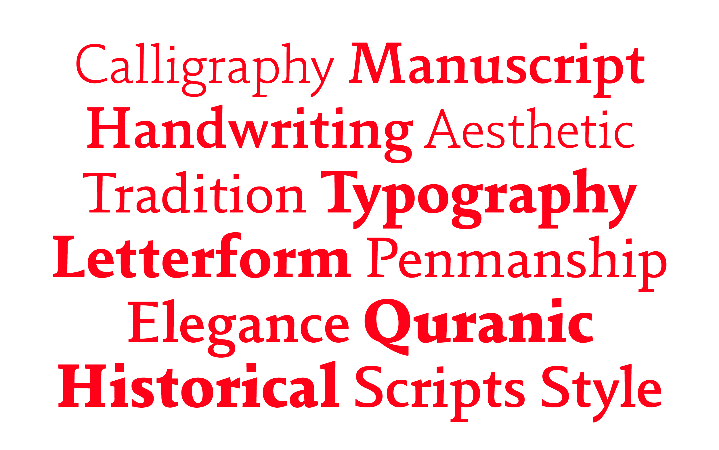
While 29LT Idris Sharp evolved, 29LT Idris Flat took a different route, featuring more straightness in both stems and stroke endings. It has solid terminals, slightly larger vertical heights, open counters, and overall lower contrast.
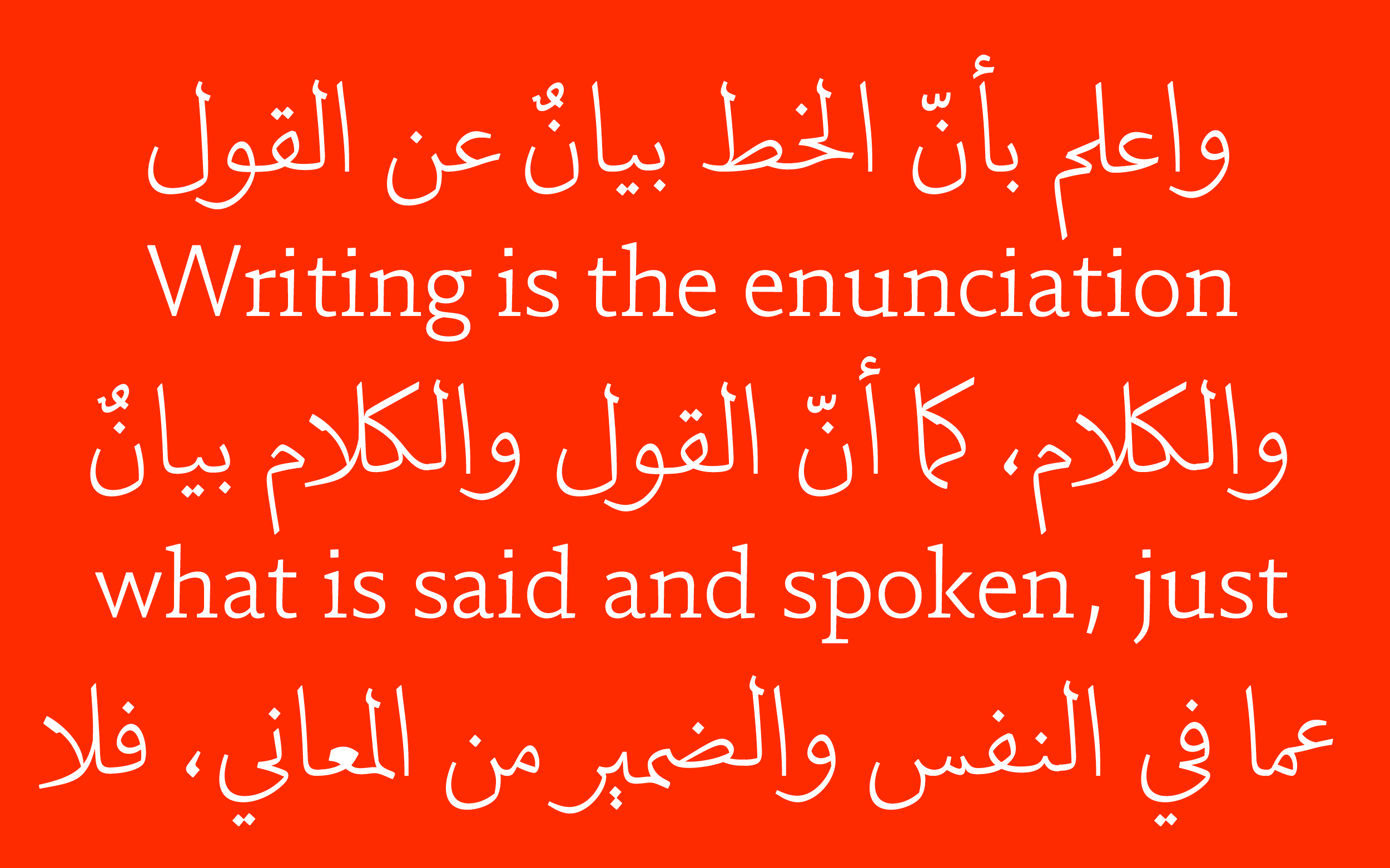
The Arabic script features some slant and even a rising baseline, which is not quite transferable if you want to stay within the traditional realm for the Latin script. However, it turned out to be optically a tiny bit slanted to the left, in both stems and rounds.
The different styles, 29LT Idris Sharp and 29LT Idris Flat, were drawn with the same width to ensure they could be easily interchangeable without causing reflow.
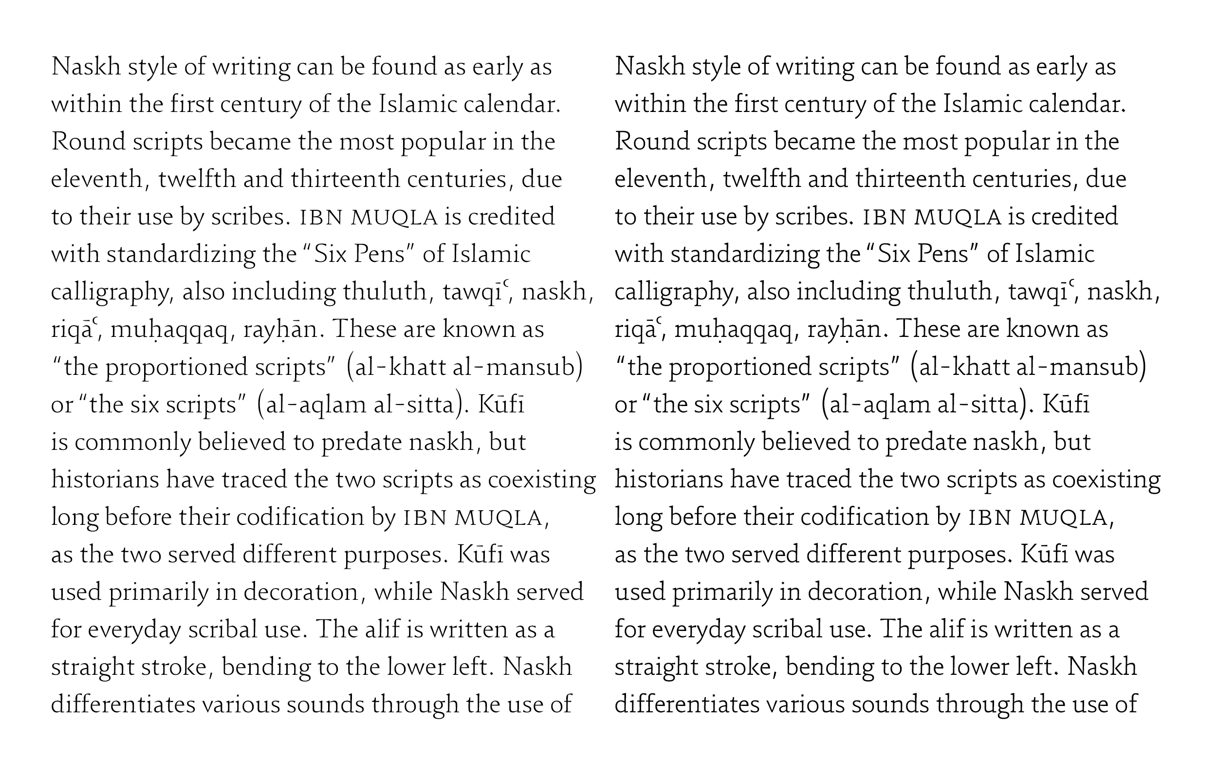
While the uniwidth was easier to achieve in the lighter weights, it became challenging in the darker ones. To compensate, the x-height was raised slightly to create more space for the additional weight.
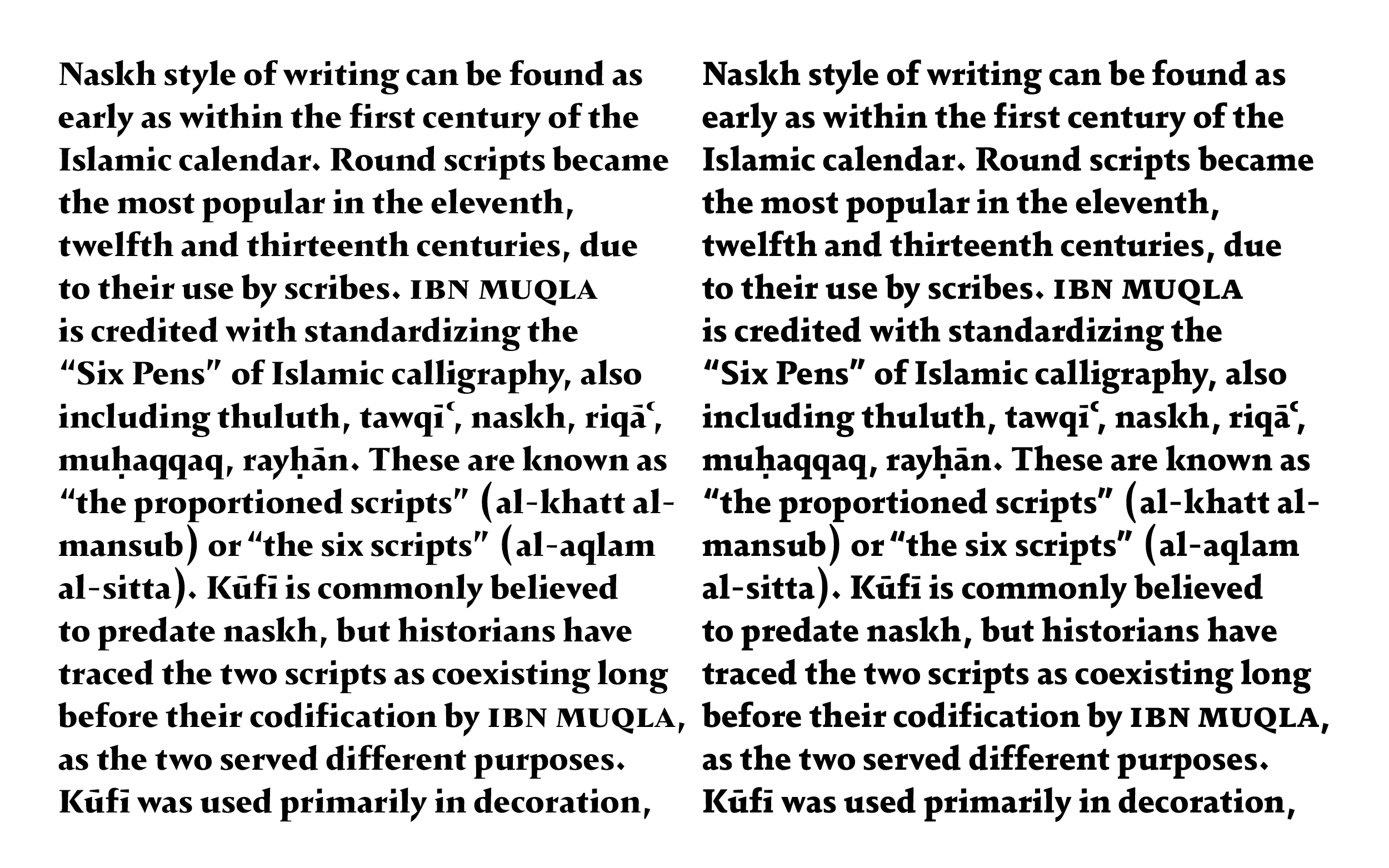
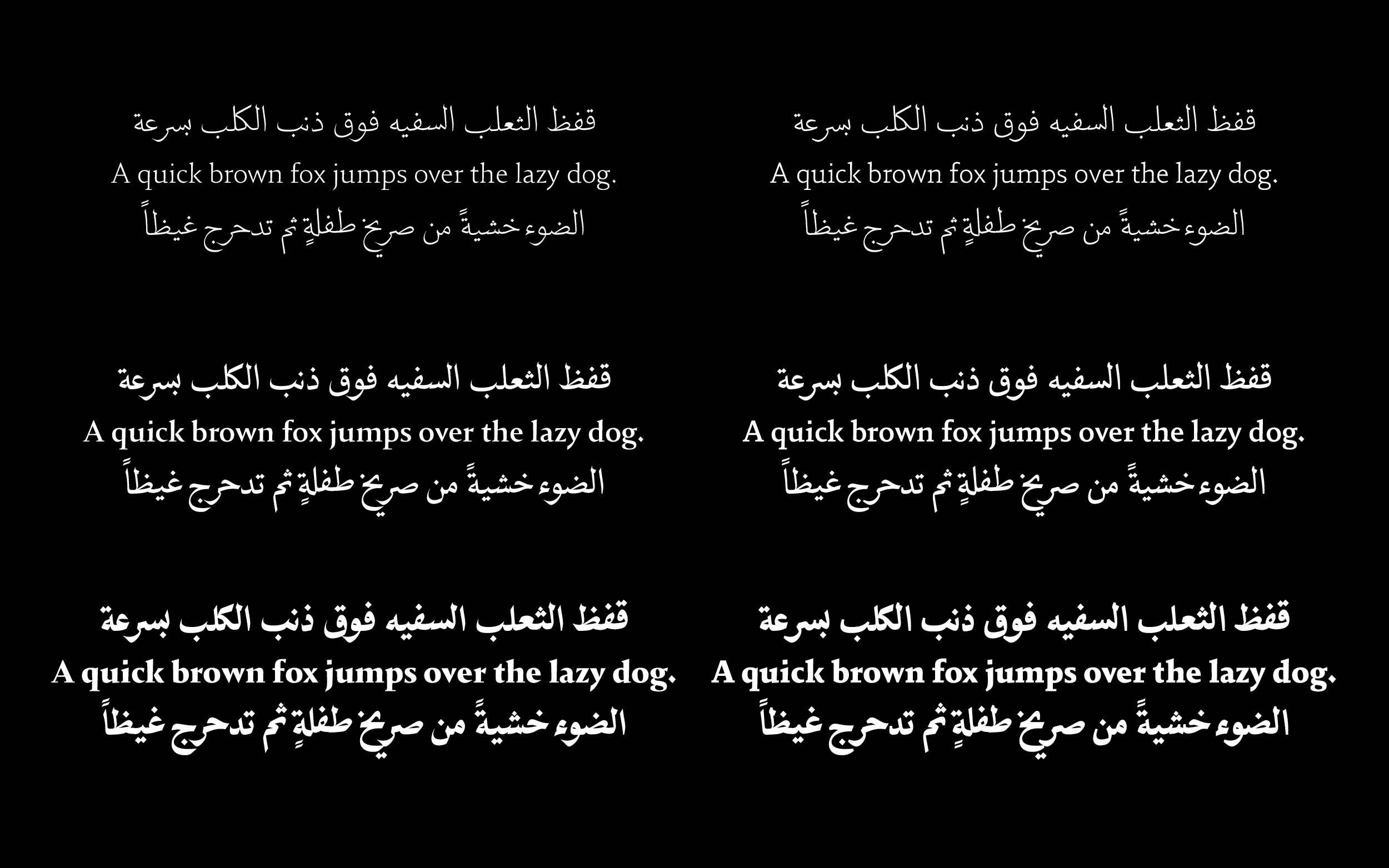
While both styles feature the same overall width (roughly, kerning might vary), the text color is slightly darker in the Flat weights due to lower contrast.
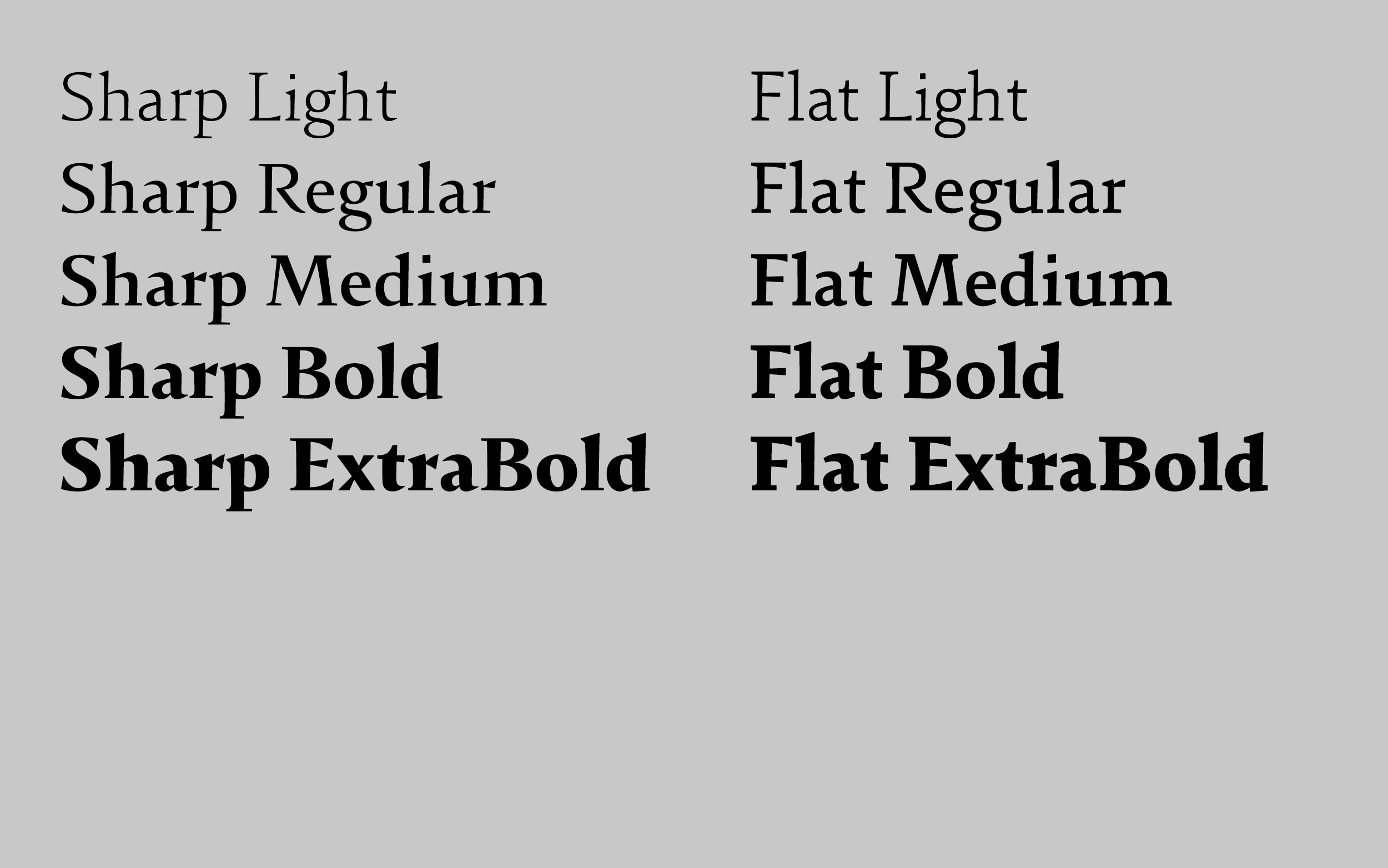
The family comes in a compact set of weights, considering they are intended for setting readable text. While the forms are expressive and lively, the character set in the Latin part is kept as compact and functional as the family itself.
Both scripts share large parts of the punctuation. The diamond shapes in the Arabic design created a lot of tension in the Latin, so they were made slightly smaller and adjusted to blend in more smoothly.
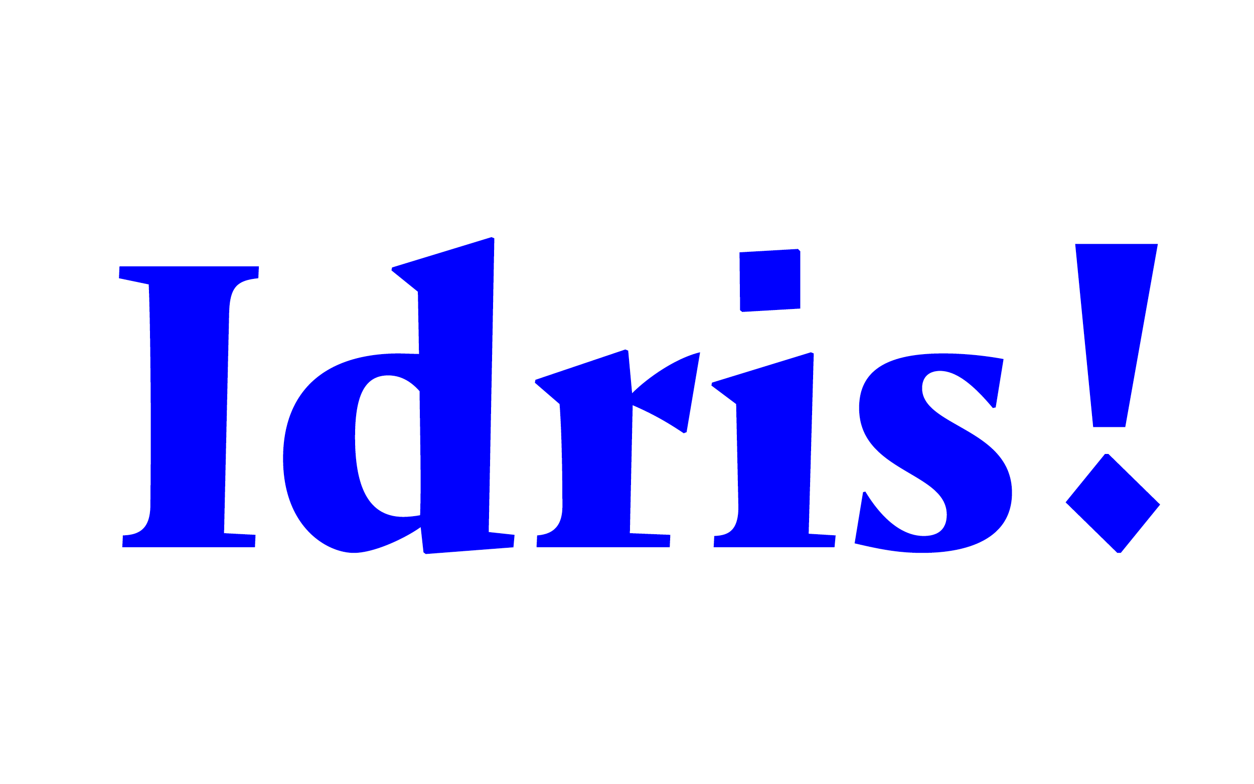
Drawn for reading sizes the medium weights aim for evenness between the two scripts.
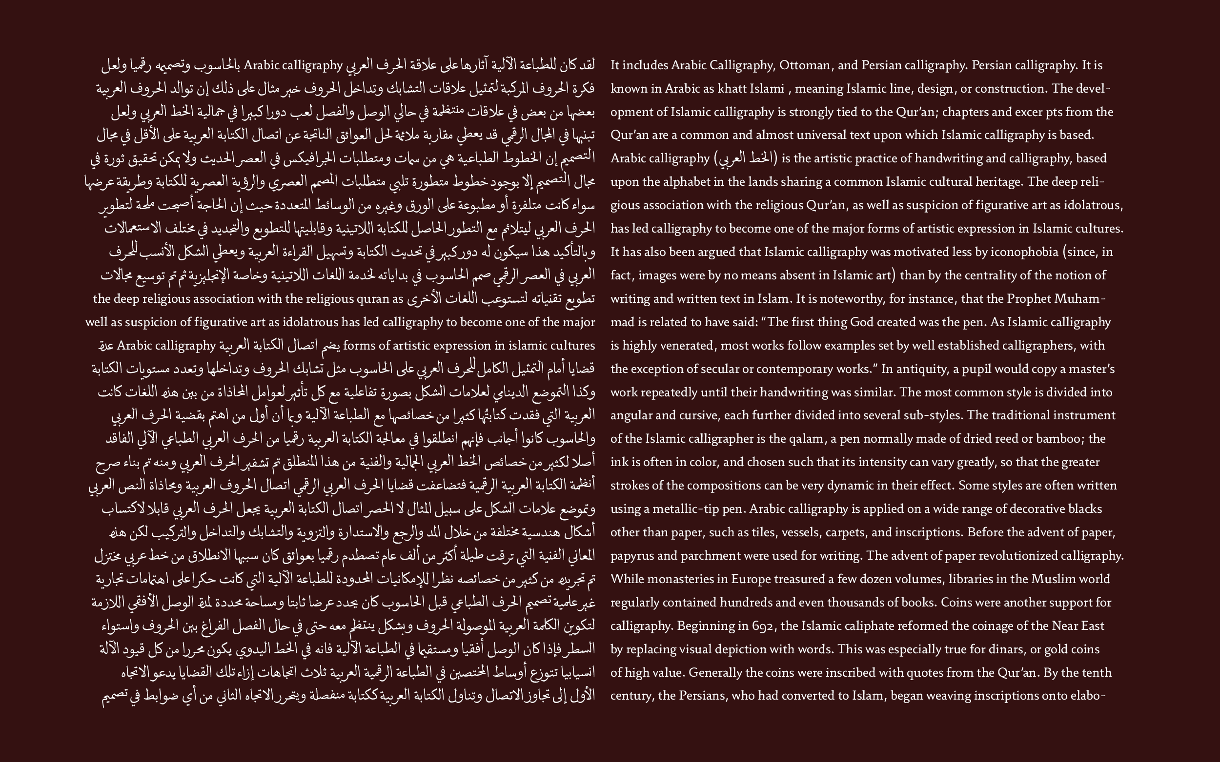
The range from Regular, Semibold up to Bold in 29LT Idris Flat give a lot of variety.
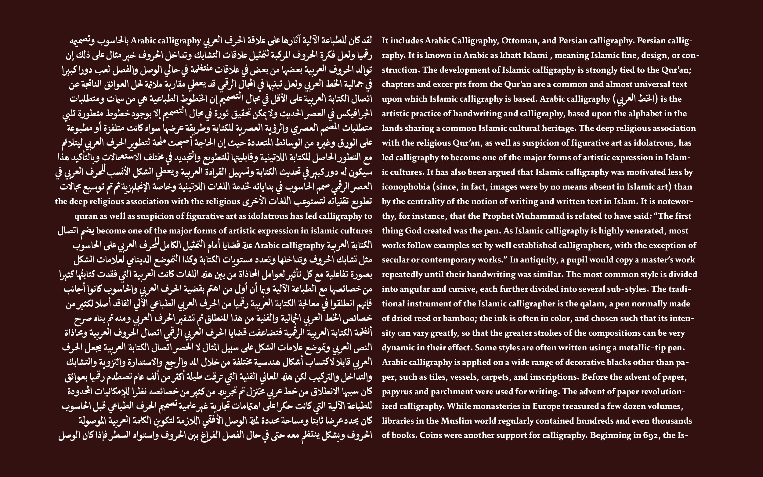
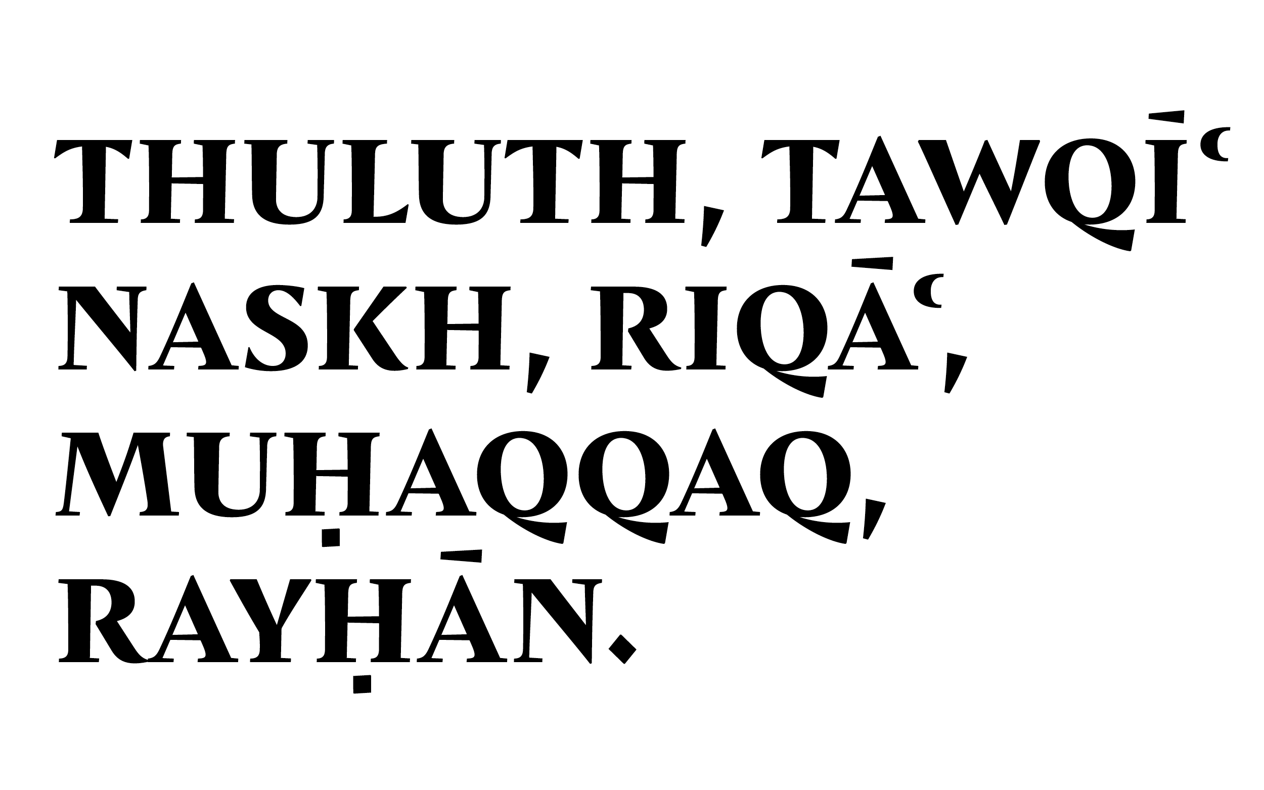
Arabic does not have the concept of serifs as such, which gave me the freedom to remove them in some letterforms while retaining them in others, introducing flared stroke endings to an otherwise serifed design. Many of the forms began as contextual alternates and ended up as the default version in the character set.
The typeface will be expanded, watch out!
29LT Idris
Collaboration with Pascal Zoghbi
Retail typeface for 29 Letters Typefoundry
Published 2024