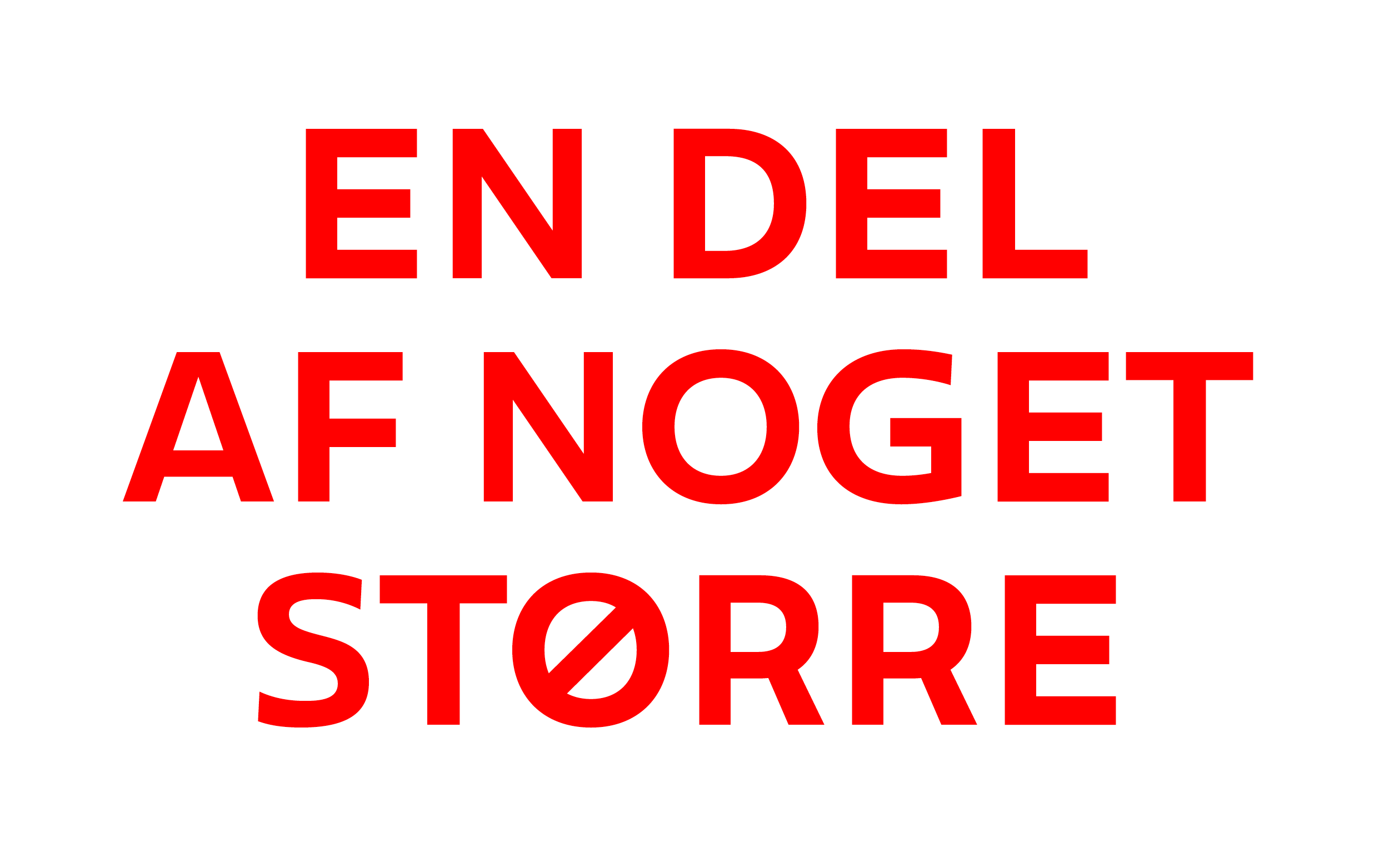
"En del af noget større" translates to "a part of something bigger", which fits team sports as well as letters in a typeface. The Danish Football Association DBU has a very distinct seal crafted by Thorvald Bindesbøll around 1900. Tuned down details made it into the typeface connecting it to history. An approachable, easy to use tool.
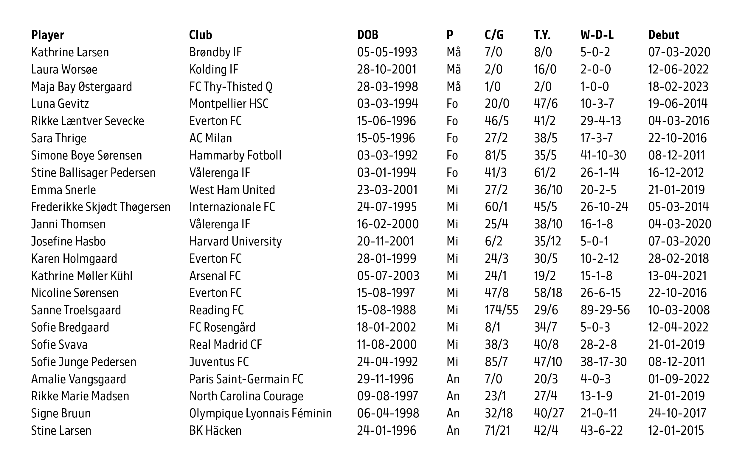
Space is often limited when it comes to lists and statistics. The same is true for social media posts with a lot of written content. The Condensed weights solve those used cases.
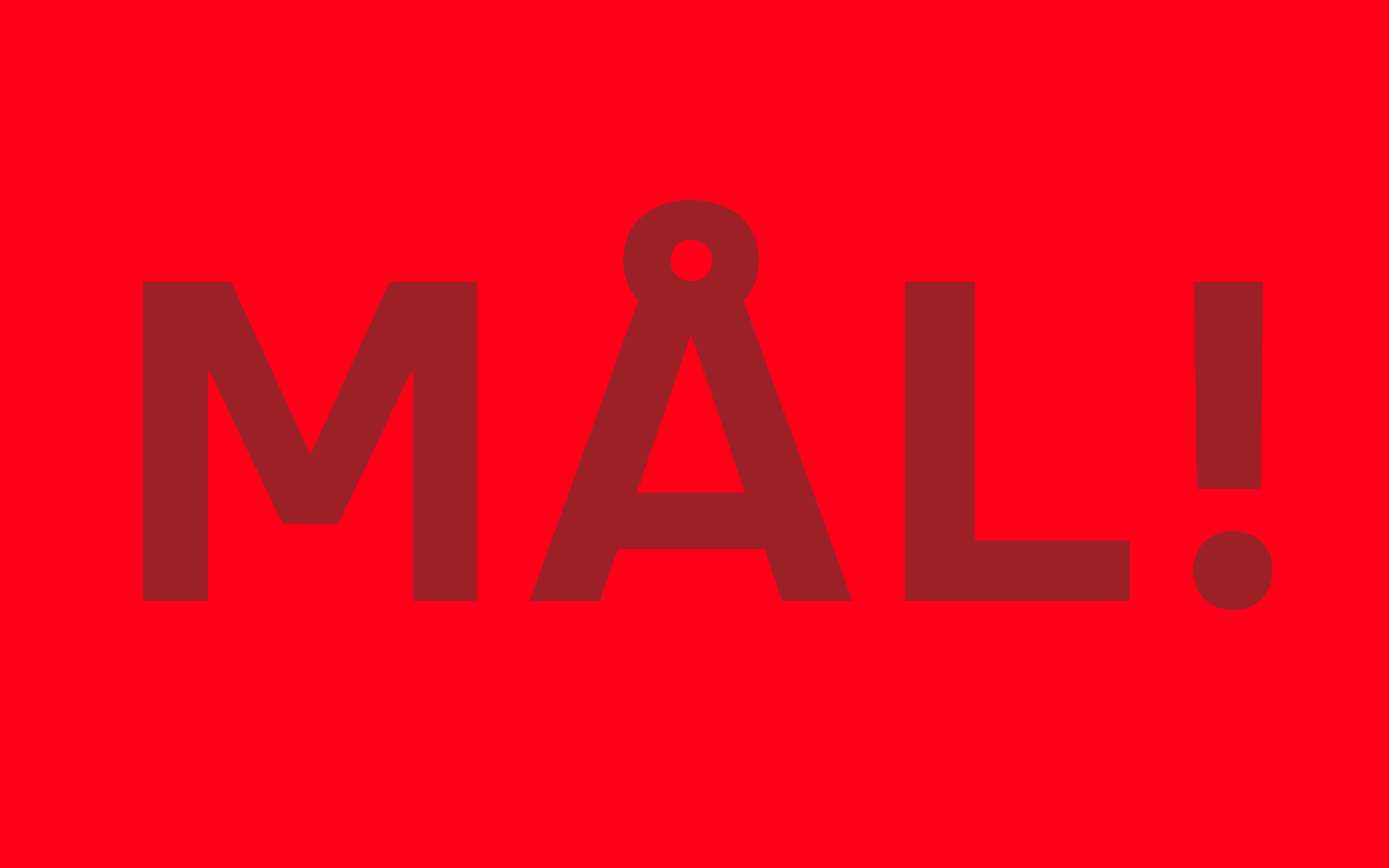
A slightly extended weight often used in Caps only does the heavy lifting on banners and in other display surroundings.
The Regular and a characteristic set of numerals are made to do the workhorse everyday job.
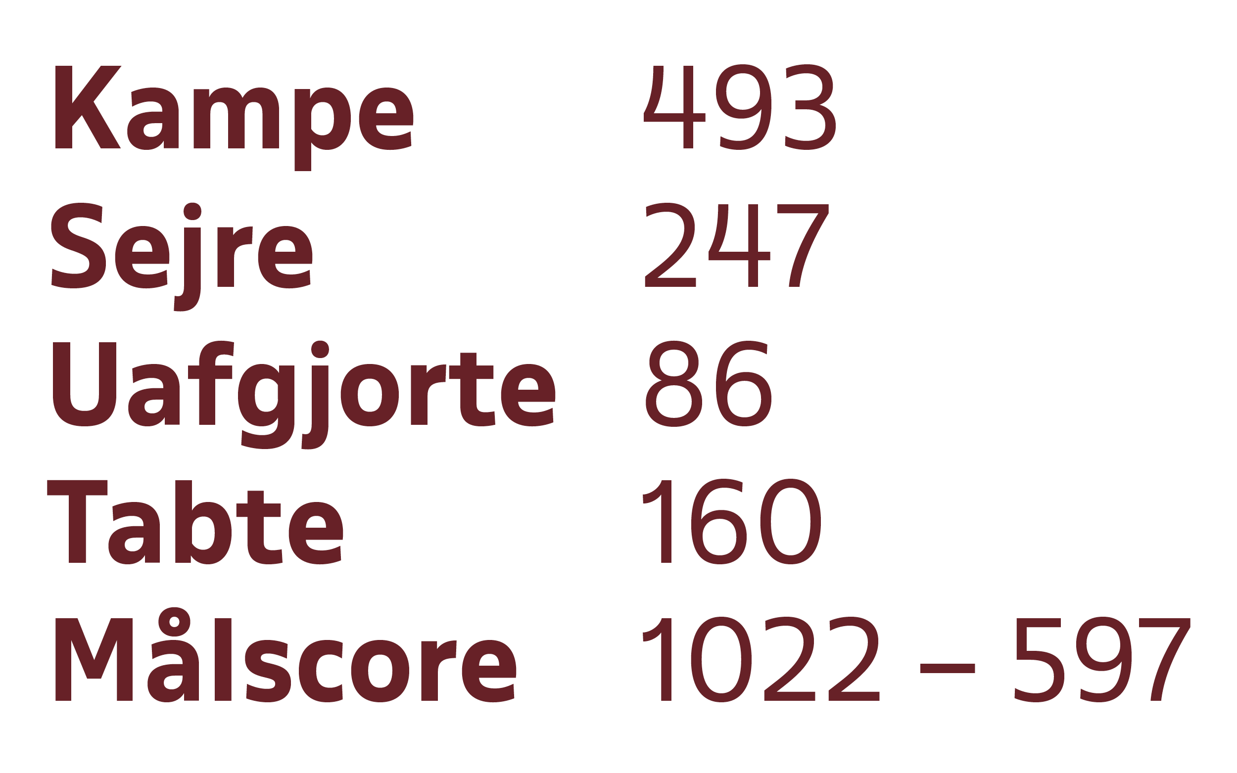
The Regular width works well in the context of running text, with a clearly distinguishable Bold weight.
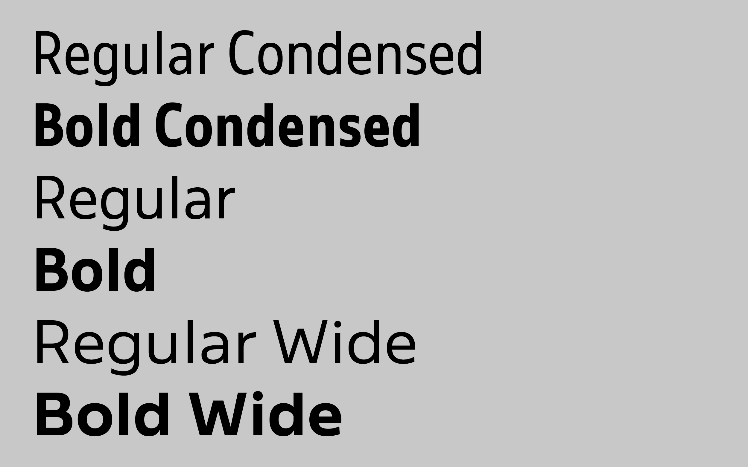
Both the character set and the family plan is entirely tailored to DBU's needs. With only two weights, yet three different widths that come in handy in the multitude of different media and channels they cover.
We see it working on banners, the website, social media posts and all kind of media. It is going to be hard to follow the games and not the letters from now on.
DBU
Collaboration with Trine Rask
Custom typeface for DBU
Through Urgent.Agency
Published 2023