Everyone needs a Mono, at least one. I drew one for myself as a tool to get thoughts organised and the studio papers look neat. A small family called Parat.
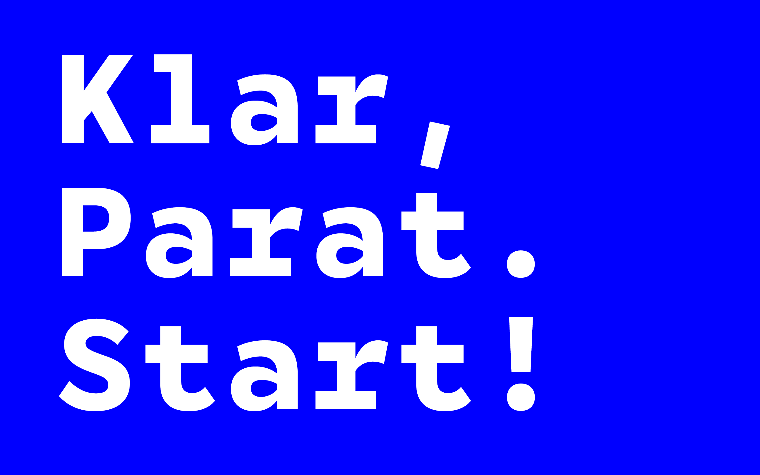
"Klar, parat, start!” is the Danish “Ready, steady, go!” – and fitted nicely to what the typeface does for me: getting things ready to take off.
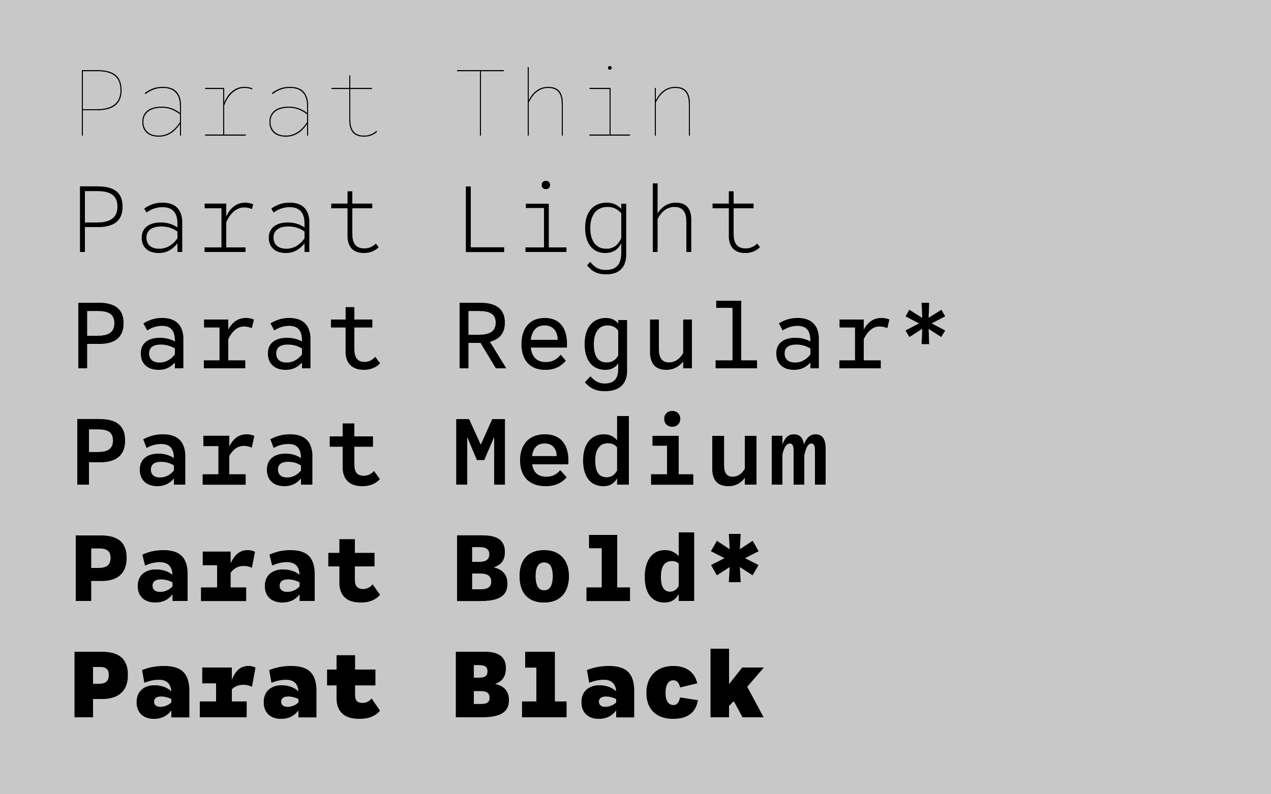
The design space is a lot bigger than the weights I ended up using in the daily work, ranging from a Hairline to a Black. The Regular weight is tuned down and unspectacular, but the design gets a distinct feel with weight compensations towards the Black.
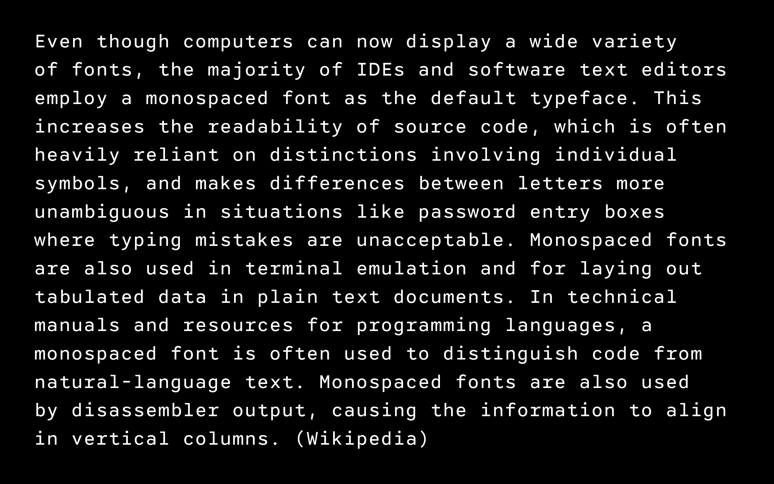
It is not ideal for running text, but the single letterforms are drawn to fit into the same space best possible to build an even rhythm.
I use it for all my communication purposes, also here on this website and it does perfectly fine.

Dear friends started asking if they could use it for their projects and so Parat is slowly getting out into the wild. Thanks go out to the mates at Studio Sirup! It gets larger on the go, when a used case asks for it extensions. Let’s see where it goes from here.
Parat
Available on request
Publication 2019 / Updates ongoing