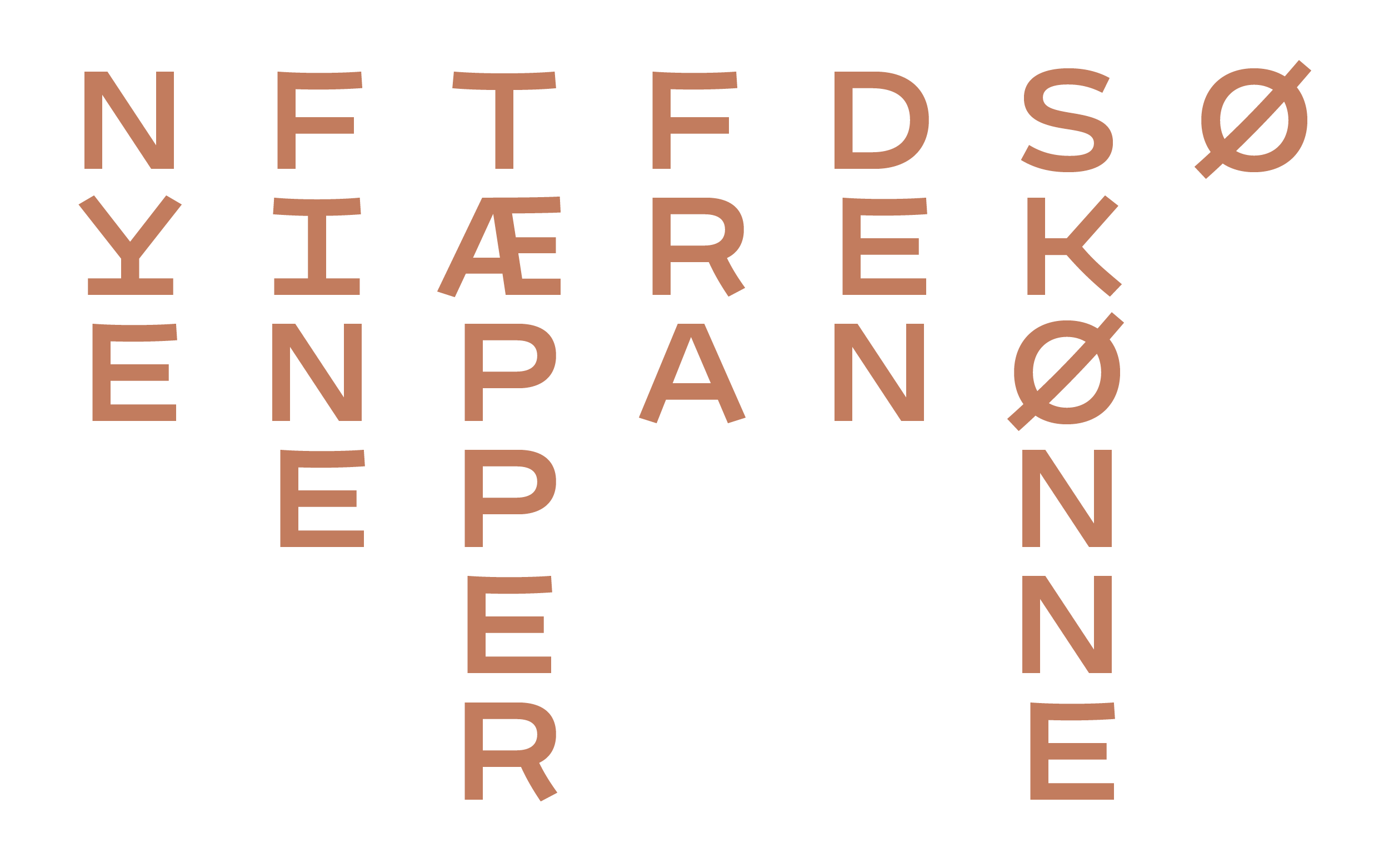
Some projects start with “We could maybe update the logo.” And then end with drawing a new typeface, because it makes sense and is more fun. Marianne Viktor runs Tomato Studio Store that sells products from both Japan and Denmark. A monospaced typeface made both horizontal and vertical typesetting quite easy and provided a more flexible yet very simple system for both communication and packaging.
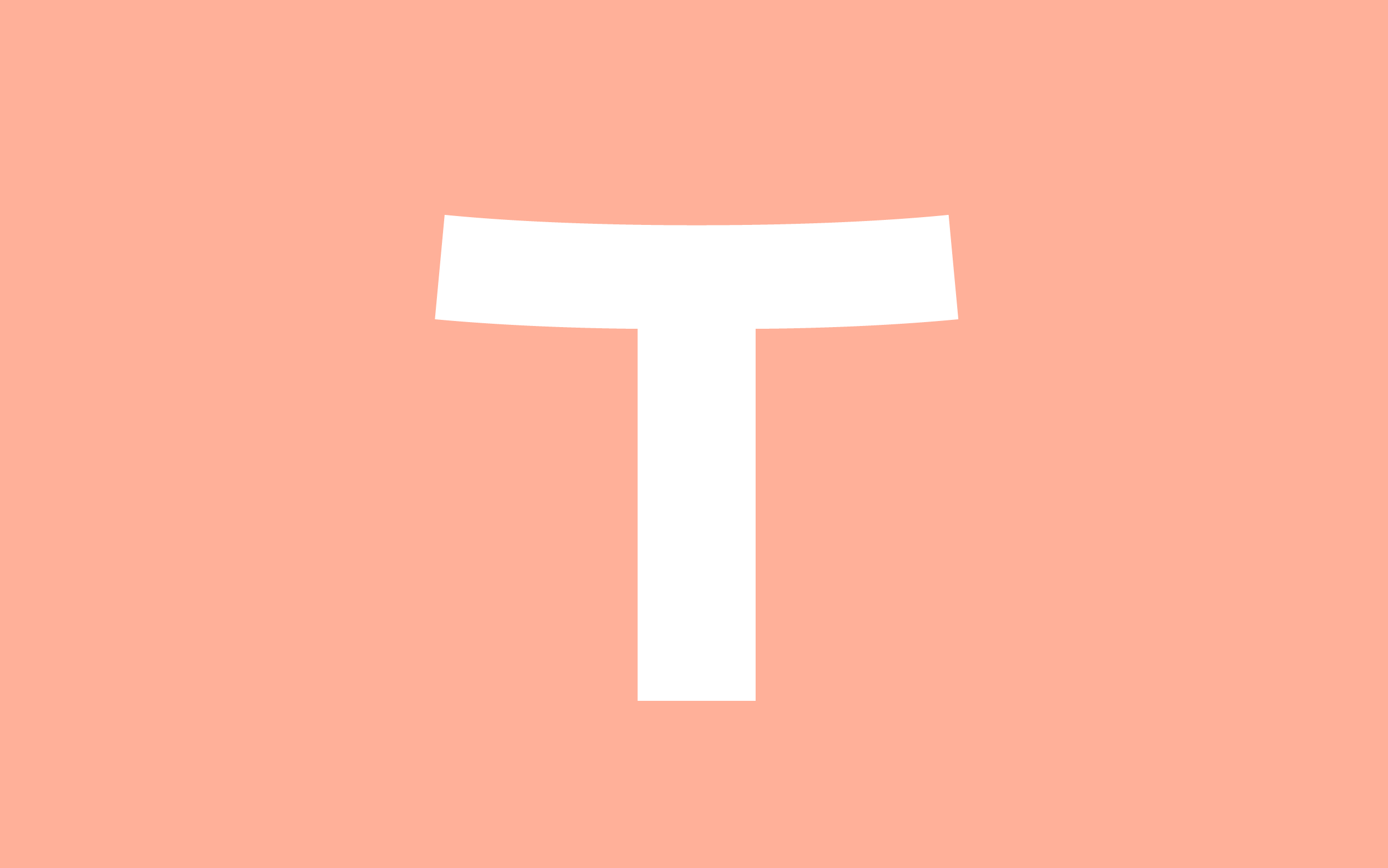
The character T has just enough life on its own to work as logo.
The overall width is based on the almost circular O, which might not be the most common letter to base a monospaced design on. We therefore ended up with a rather wide overall design.

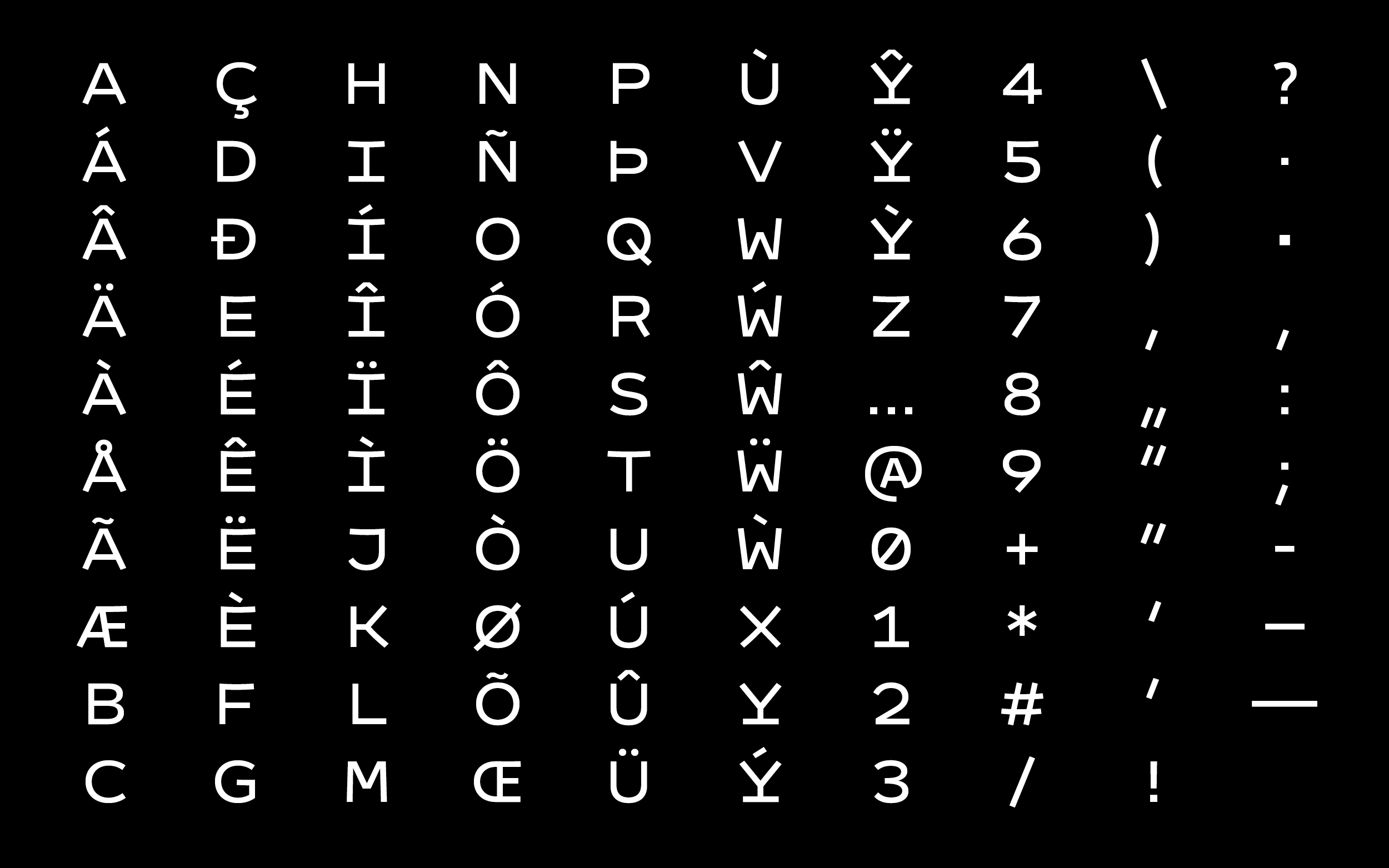
The character set is very compact and entirely tailored to Marianne's needs. A restricted scope makes it possible to draw custom typefaces also for smaller companies.
The typeface comes in three weights to have the possibility to adjust and highlight in situations where needed.
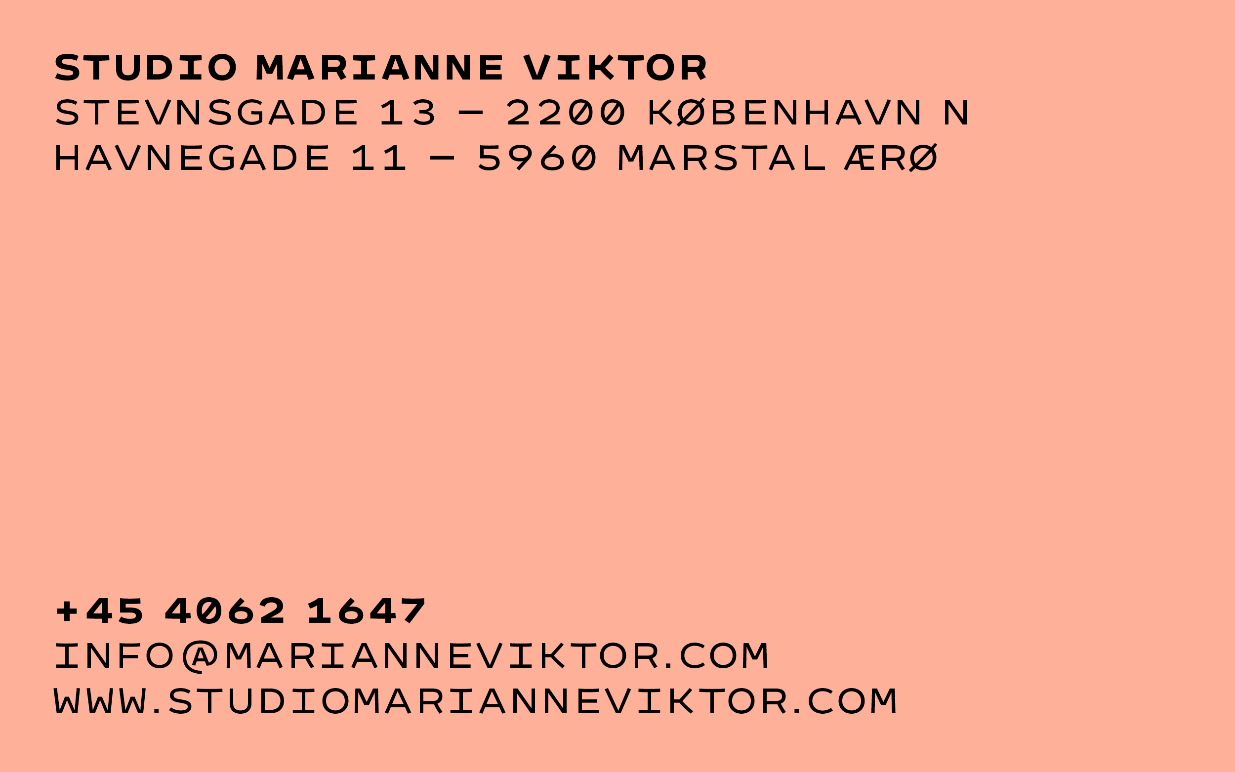
While being monospaced when set vertically there are some kerning pairs to compensate for the rough mono typesetting when it comes to larger amounts of horizontal text. Some letters or for example the punctuation also run on half or double widths.
During the course of usage the scope was broadened to an additional slanted version.
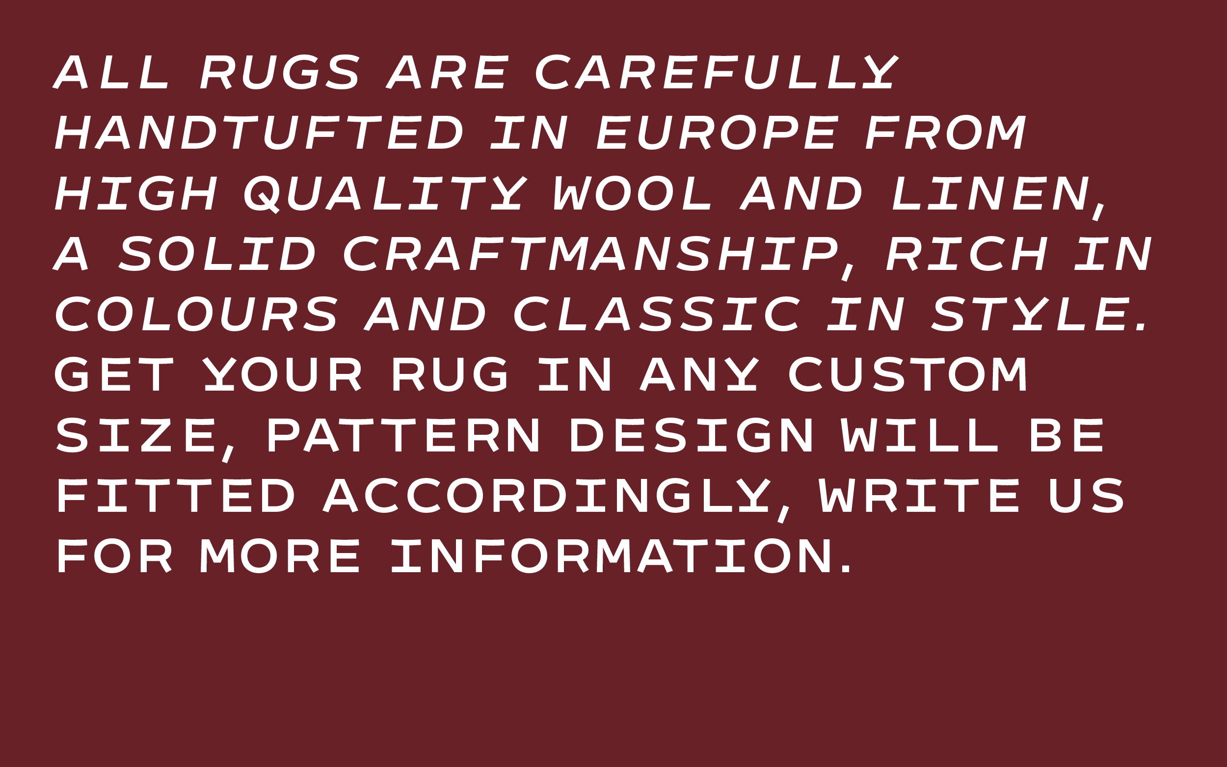
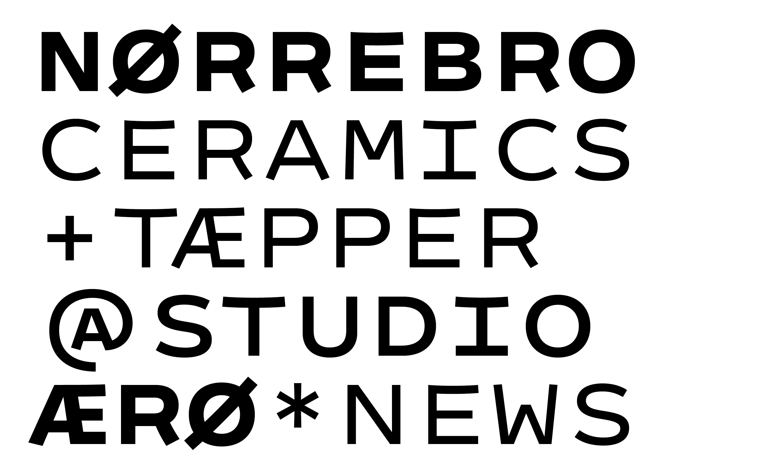
Let’s see what there is yet to come. And have a look at the rugs and ceramics, they are beautiful.
Tomato Mono
for Studio Marianne Viktor
Publication 2020 / Update 2023