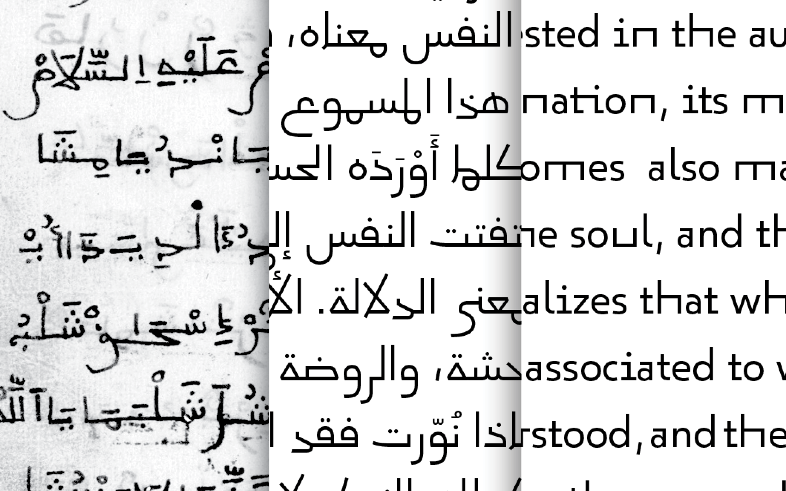
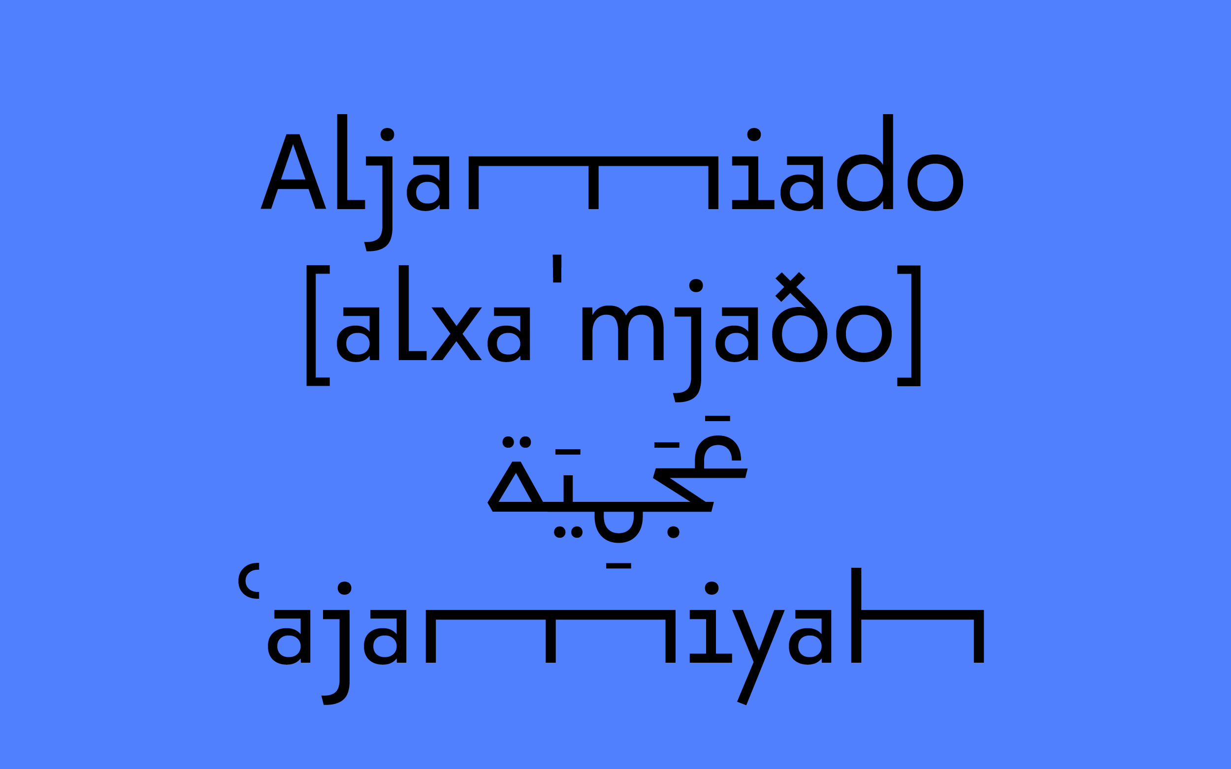
Pascal Zoghbi started the project inspired by Aljamiado, a collection of manuscripts that use the Arabic script for transcribing European languages, especially Romance languages such as Mozarabic, Portuguese and Spanish amongst others. If you want to dive deeper into the topic of Aljamiado and the design process it triggered, this is a really interesting read.
As the Arabic inspiration was used for transscription the design of the Latin counterpart felt both conceptionally special and turned into a real riddle to solve. The forms were supposed to come from non-scholar handwriting and echo the very constructed Arabic Kufiq style to name just two contradicting base parameters.
Due to the manuscript base, there were extremely long ascending and descending forms, yet the wish to come up with a contemporary design solution. Two main directions were distilled out of the rich archive: a constructed and a fluid version that turned into 29LT Okaso and 29LT Oskura respectively.
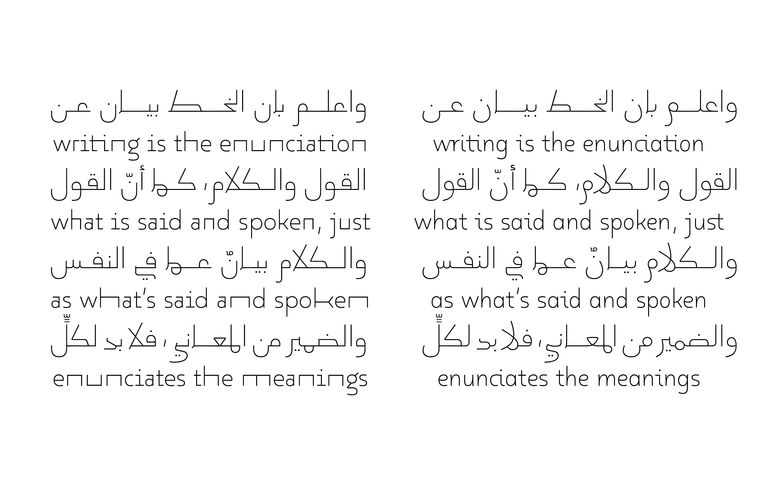
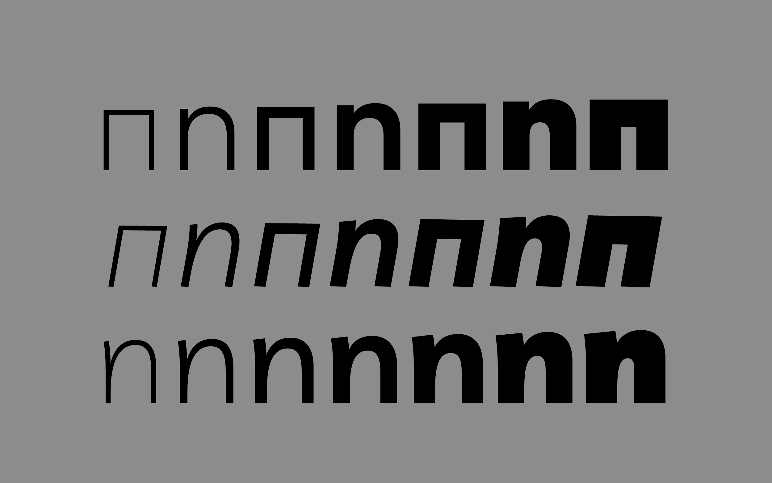
The Latin lowercase letters come closest to the core of the Arabic character set. To echo the liveliness of both the handwritten and the Arabic letterforms a contextual alternates between round and straight alternates was introduced.
To come closer to the fluid widths found in the manuscripts 29LT Okaso features a special trick: a stretch axis that can be both applied on single letters and ligatures. This trial in the Latin reflected back to the Arabic and added even more flexibility, the magic of a true collaborative process.
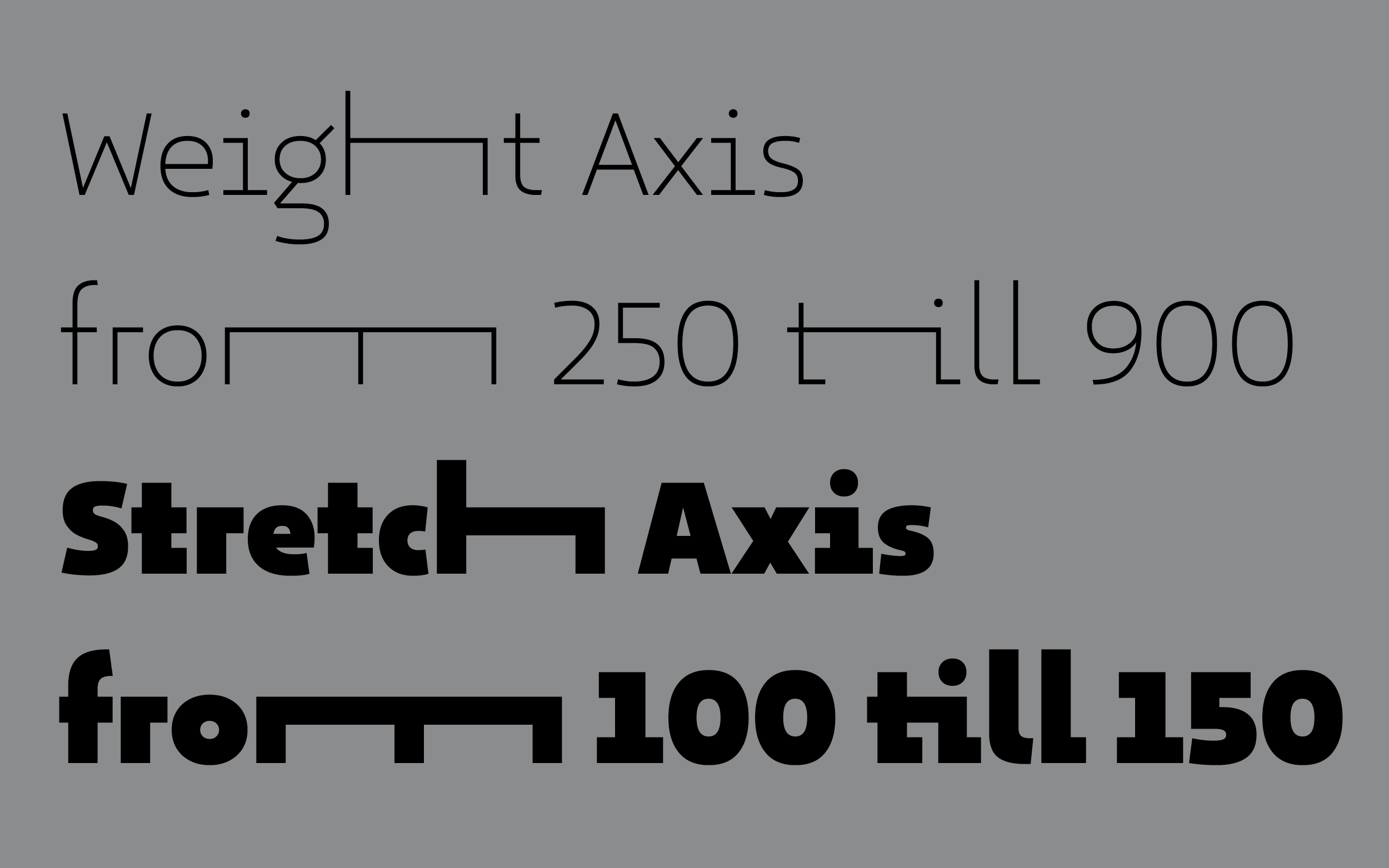
We added a stretch as well as a weight axis to the designspace, so the letters can be adjusted to a specific width and weight by the user.
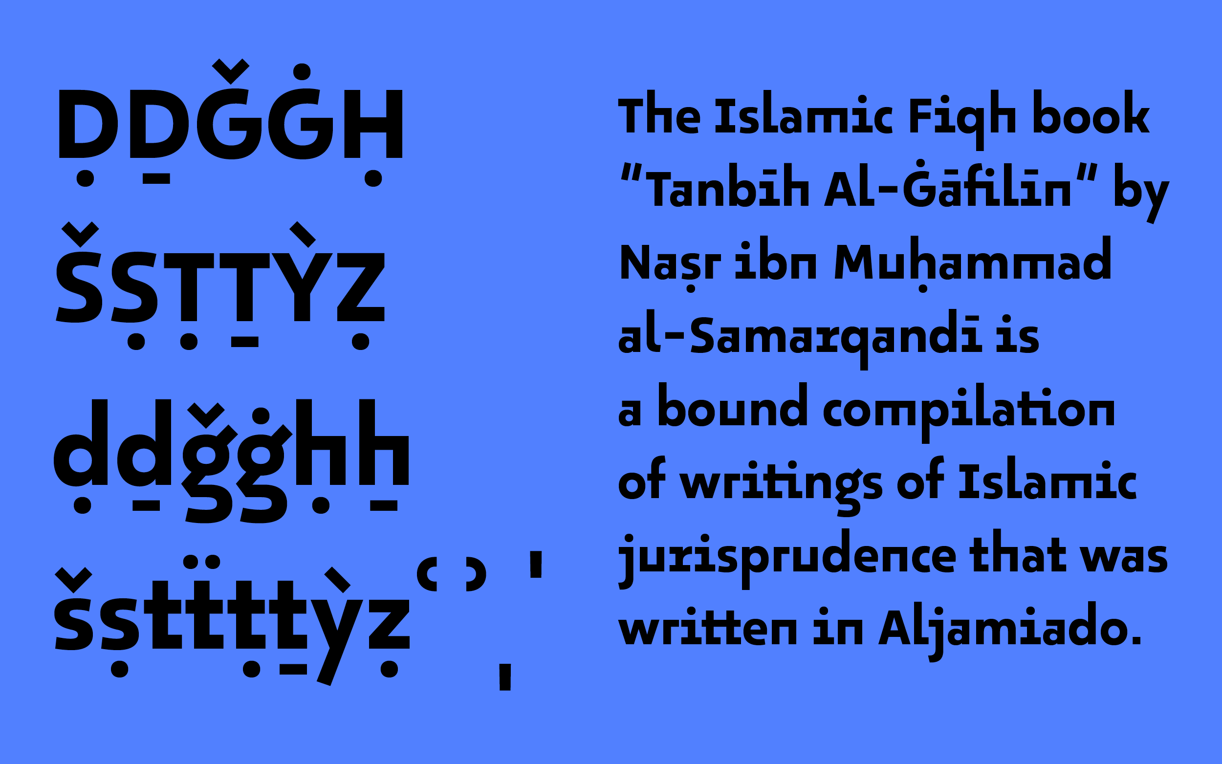
29LT Okaso supports the international Iso Norm 233 to make transliteration of Arabic into Latin characters possible. Now we can do the full circle.
The family, which now looks planned out grew, over time. The origin was 29LT Okaso, followed by 29LT Oskura and completed by a slanted style that could be used with both families.
Arabic has got a lot more vertical heights than our rather restricted Latin. Having the Latin cap height as a halfway intermediate between the lowercases and the ascending heights introduced at least three levels. Both scripts had a strong influence on each other during the design process and that made us push the boundaries.
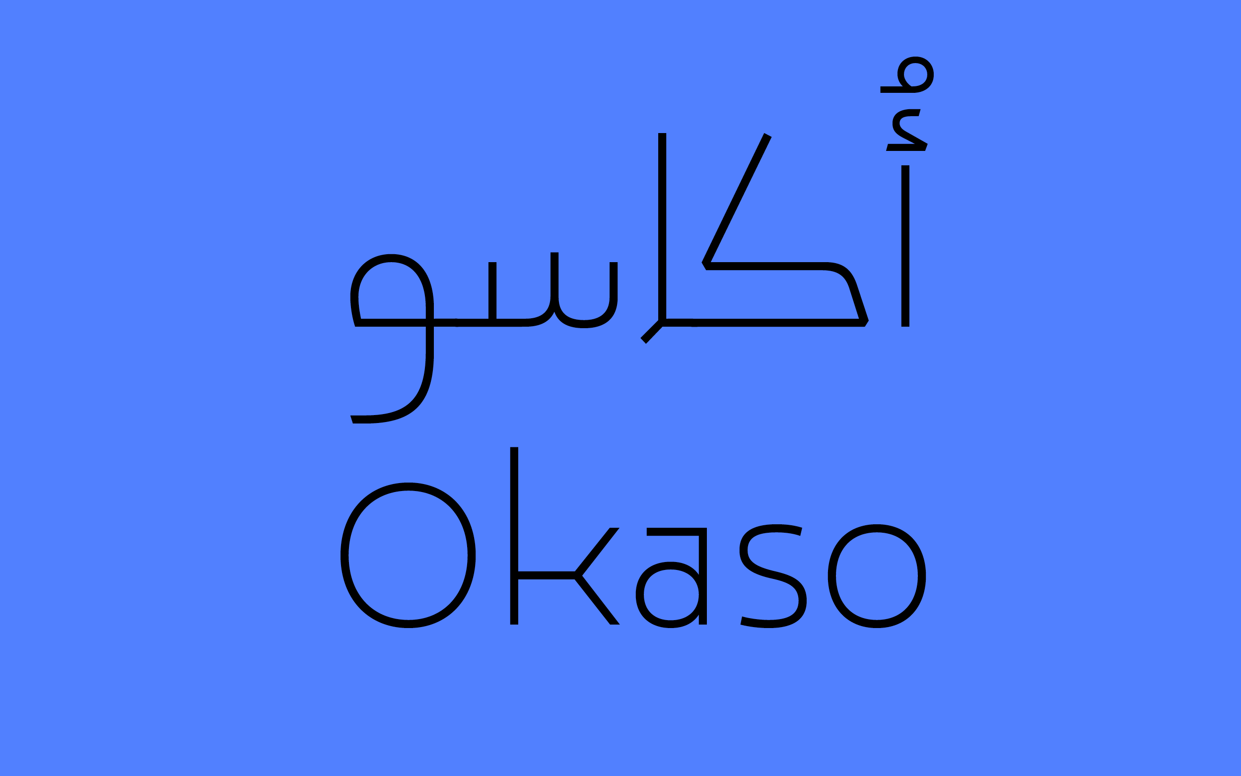
29LT Okaso
Collaboration with Pascal Zoghbi
Retail typeface for 29 Letters Typefoundry
Published 2020