Praxis and Demos are two typeface families that Gerard Unger drew exclusively for the company Hell and their Digiset machines in the mid 1970is.
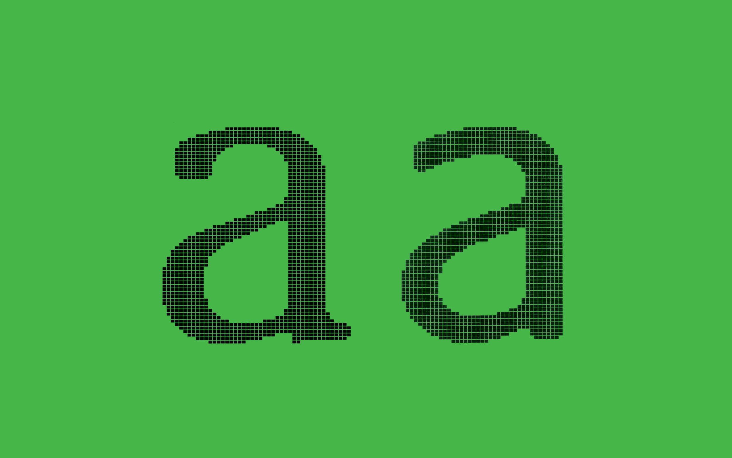
Letterforms were drawn onto a rather coarse grid and got stored as bitmaps encoded on punched paper.
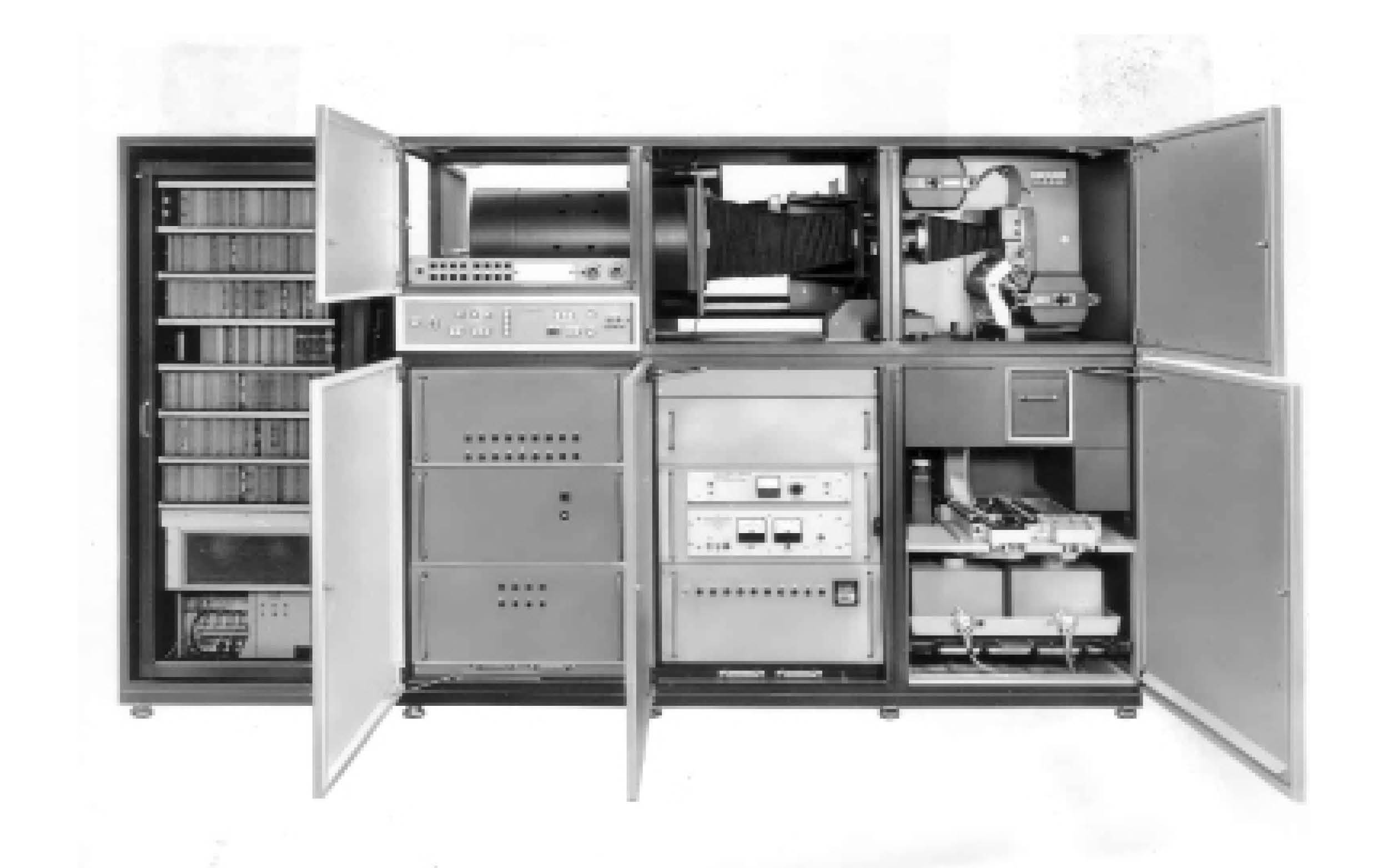
The Digiset was one of the first digital typesetting machines. It used television technology (cathode ray tubes) to compose images of letters that were then projected on film or paper. Watch some small printing history films, it's a lot easier to understand when you see it in action.
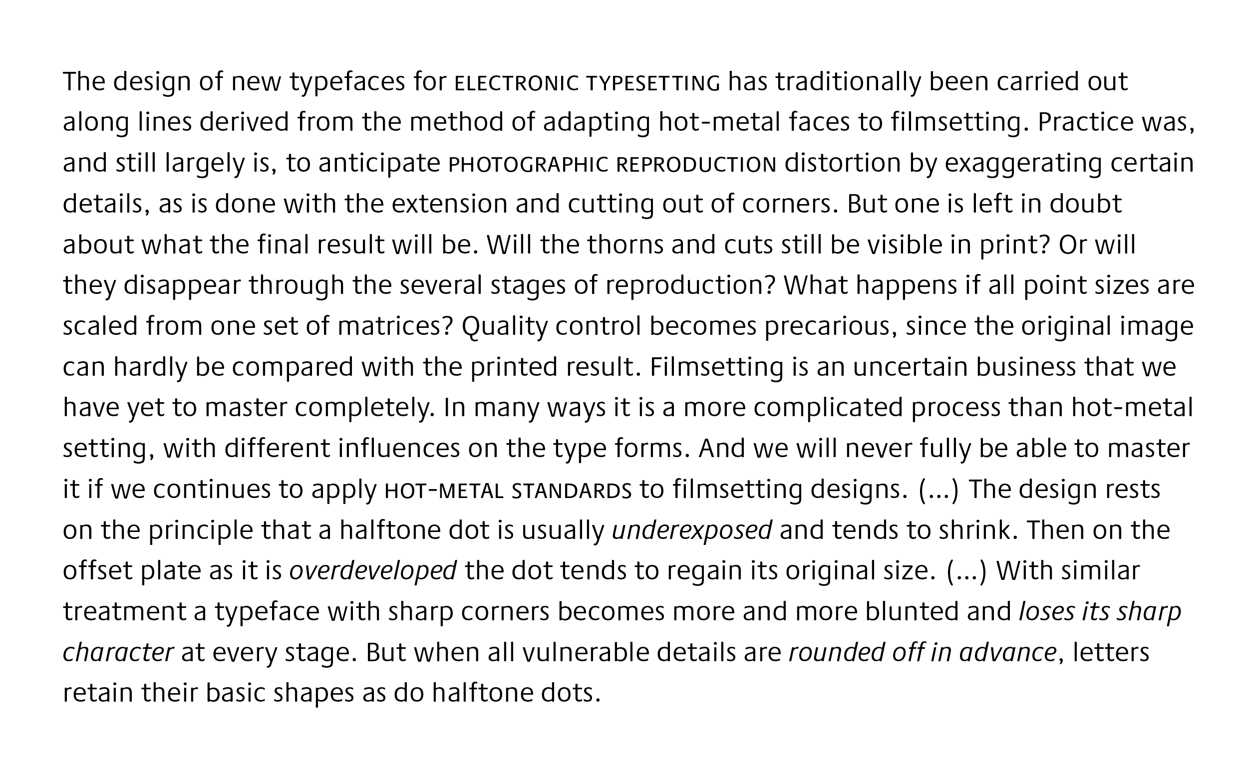
Expecting that letters would be rounded through the process of exposure, Gerard prerounded his design to be in control.
With their high x-heights and open inner spaces both Demos and Praxis were designed to be workhorse typefaces.
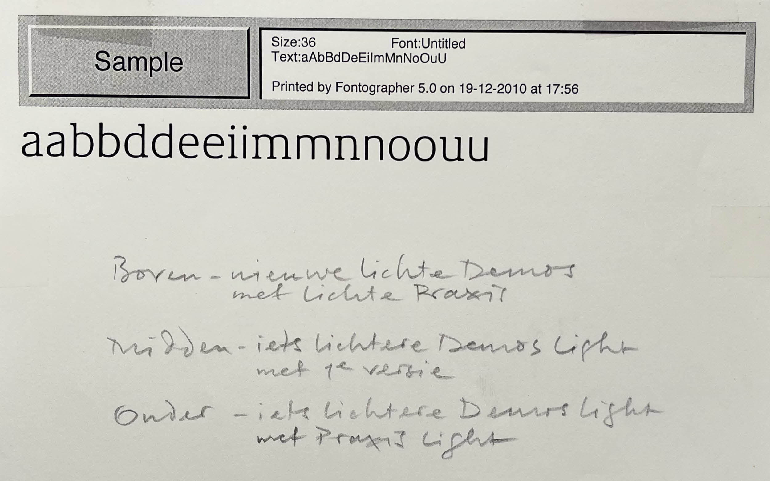
I overtook the process of redesigning Demos for contemporary use from Dan Reynolds and started on reworking and extending Praxis accordingly.
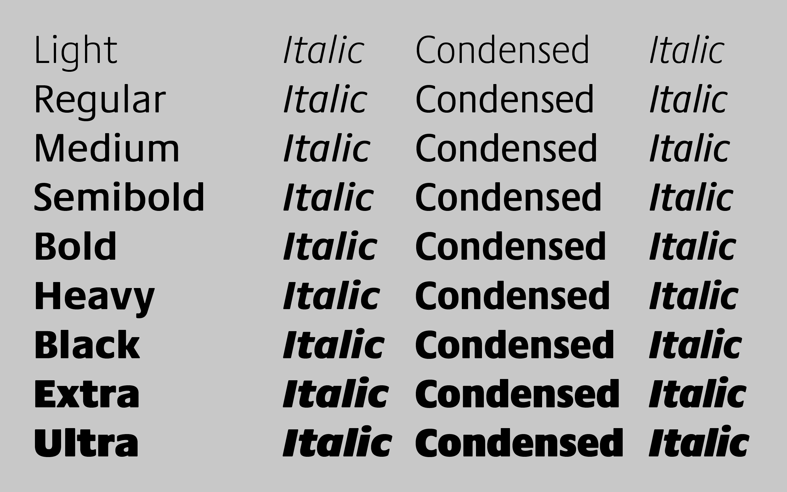
We added the darker weights, drew a real Italic and added the Condensed companions. A lot of forms needed revisiting, now freed from the rigid Digiset grid. The roundings had become so crucial to the design over time, that they survived all redesign processes.
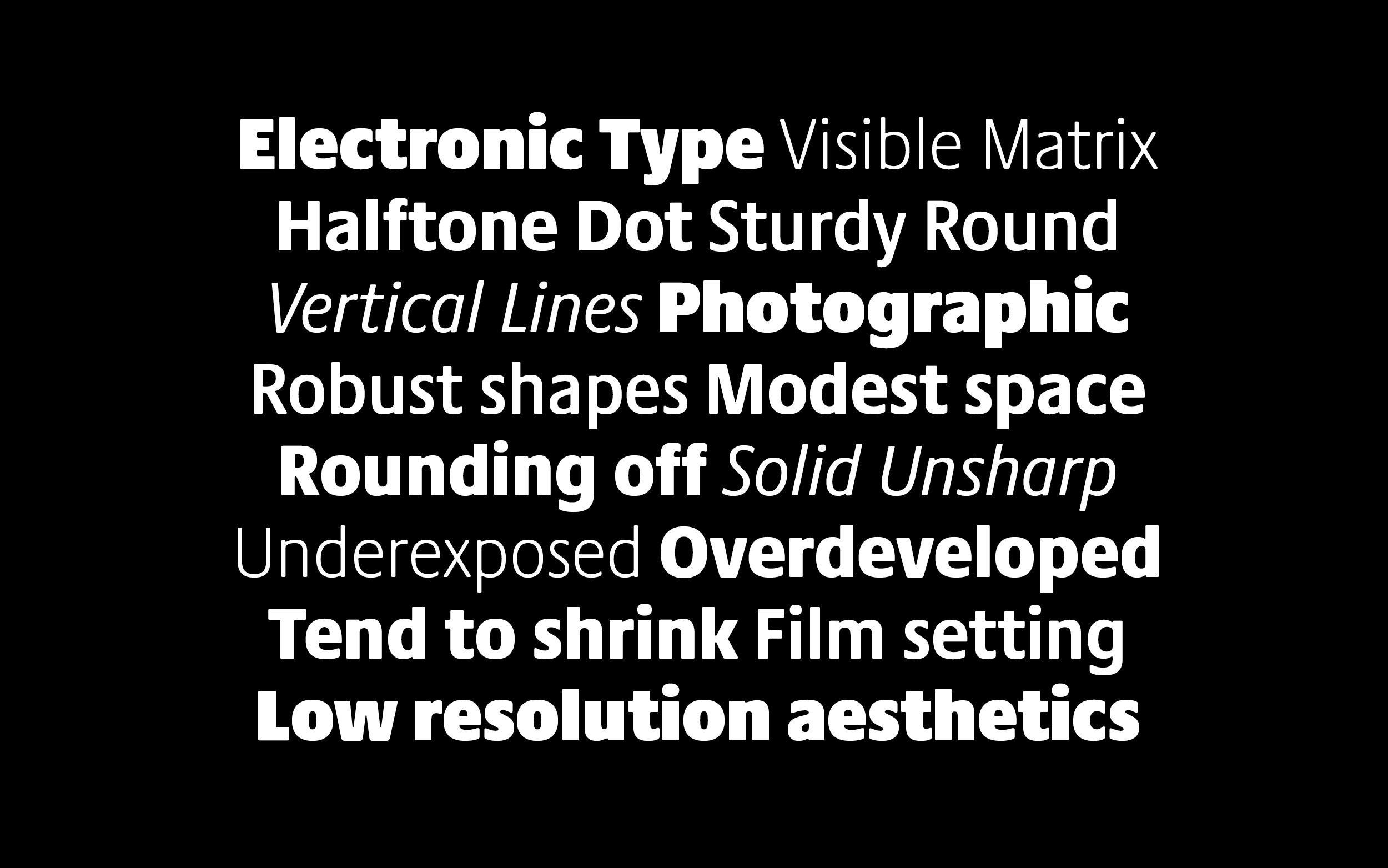
Praxis Next as Demos Next as most of Gerard Ungers typefaces were made with good readability in mind. We added smallcaps and a true Italic for wider typographic options.
It is unbelievable how much I learned during this phase, both from Gerard, but also from colleagues and friends along the way.
And I still really enjoy to see Praxis Next in use for the captions in Gerard's monograph "life in letters" written by Christopher Burke.
Praxis Next
Collaboration with Gerard Unger
Retail typeface for Monotype
Publication 2017