Plak was Paul Renner's second typeface after Futura. It was published in 1928 as a display companion to Stempel's Reform Grotesk. Toshi Omagari and I set out to undust this hidden gem by collecting all possible original sources we could find.
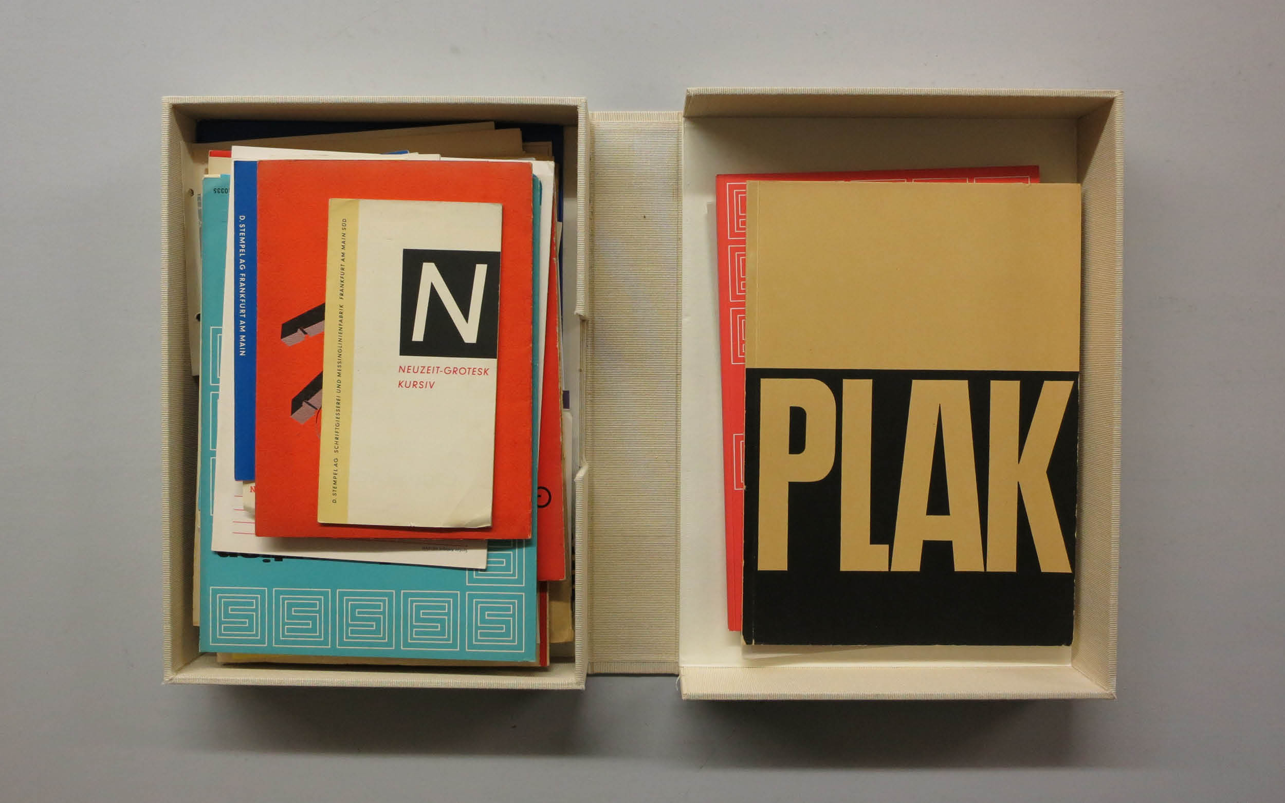
One specimen "Die Plakatschrift des Modernen Buchdruckers" by Schriftgießerei D. Stempel AG can be found at the Klingspor Archive in Offenbach.
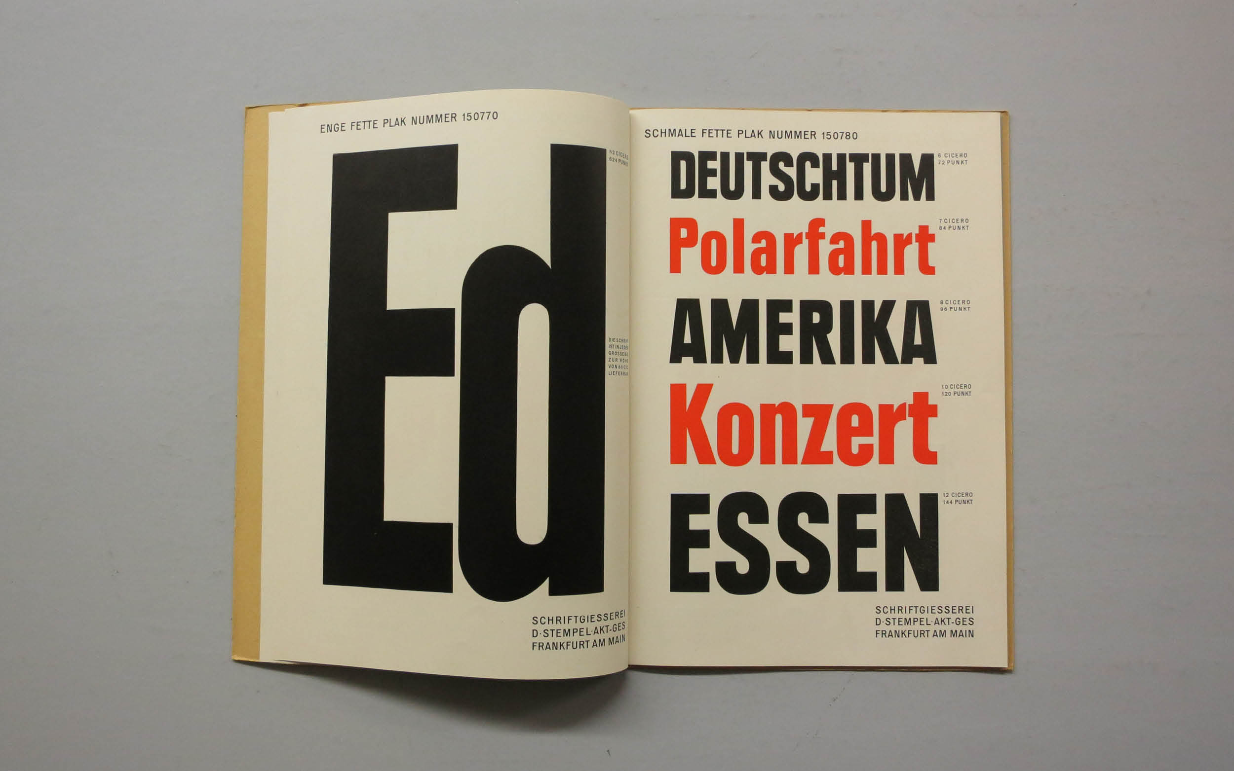
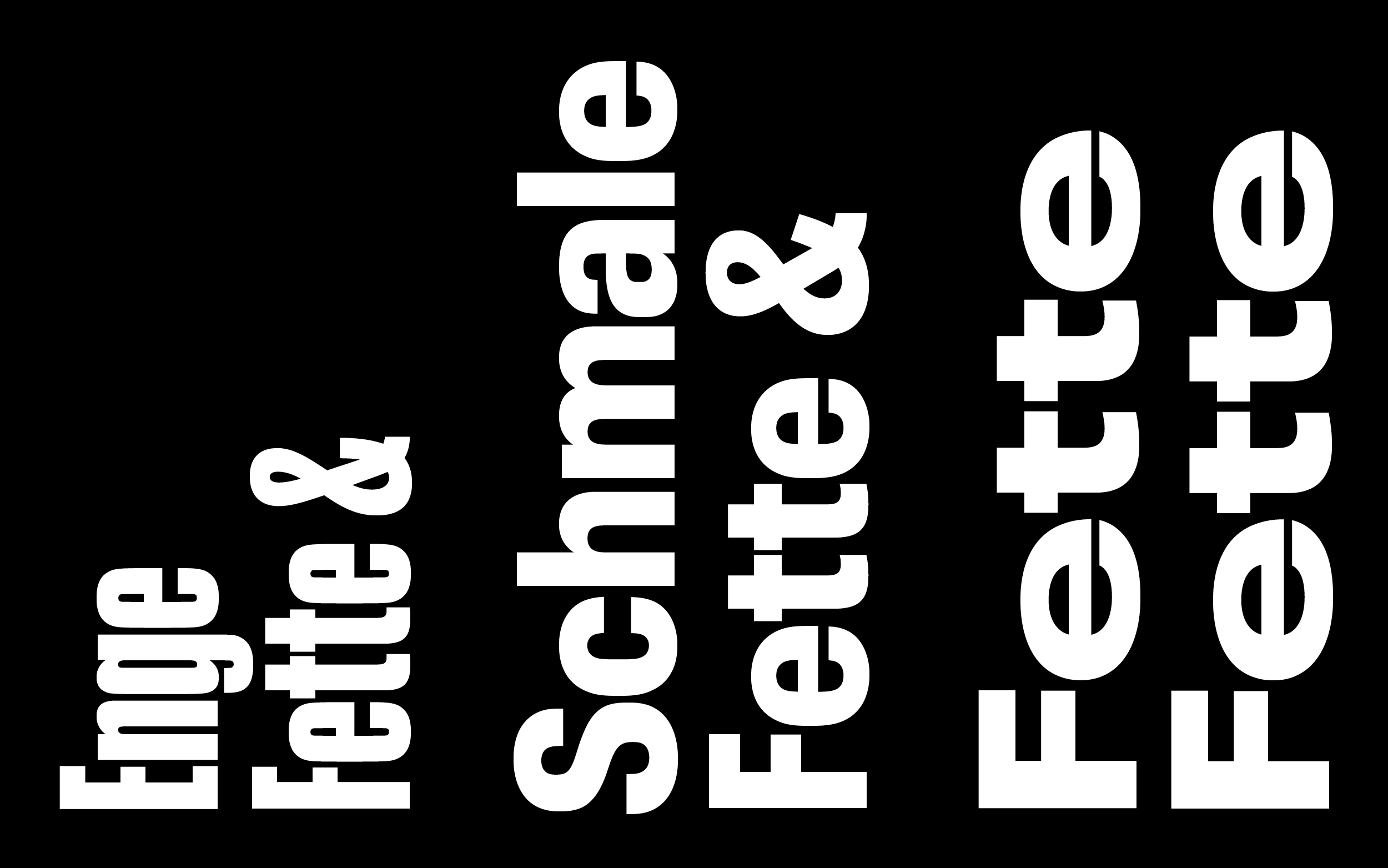
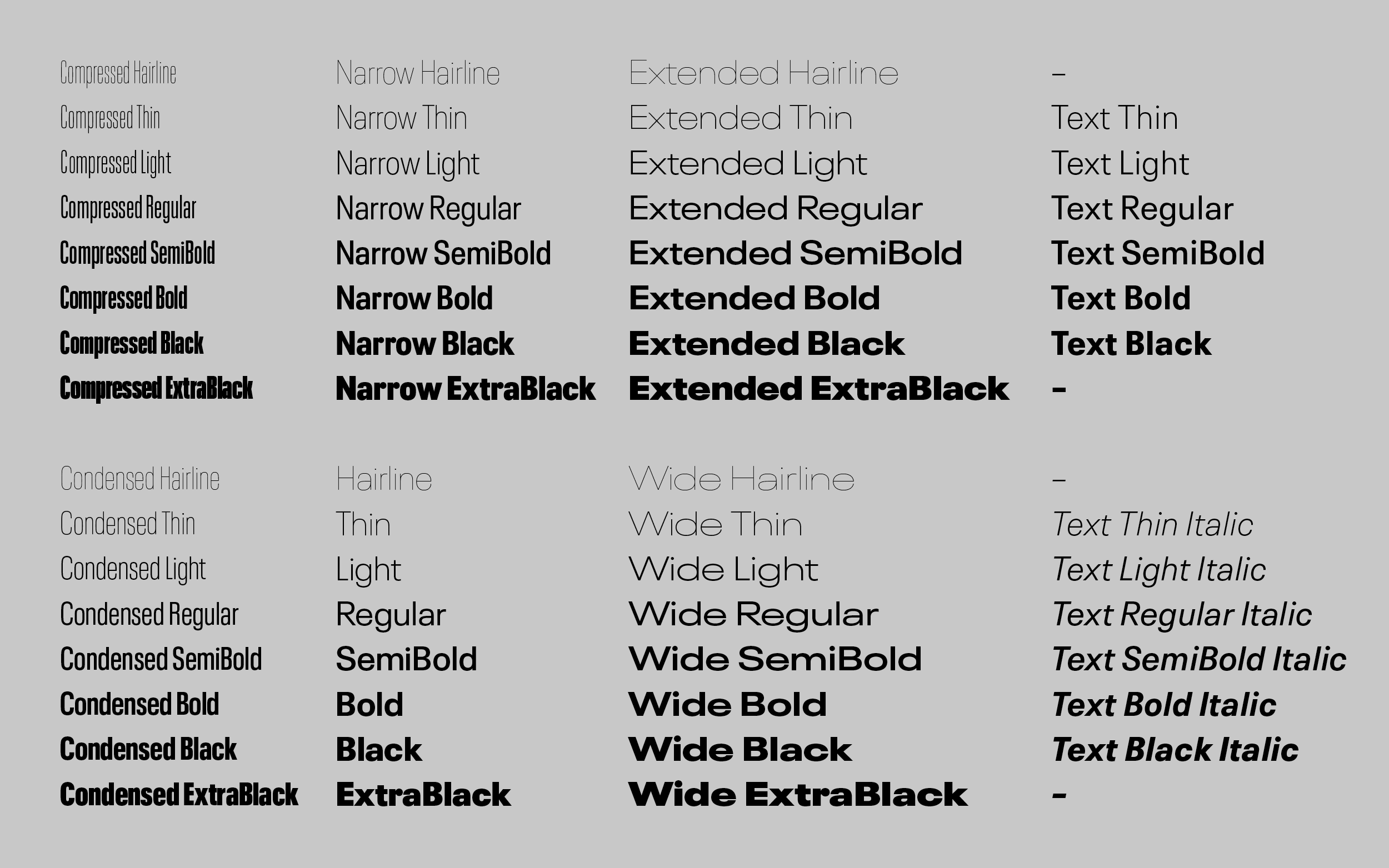
Originally it was available in three different widths, ranging from Compressed over Condensed to a Wide cut.
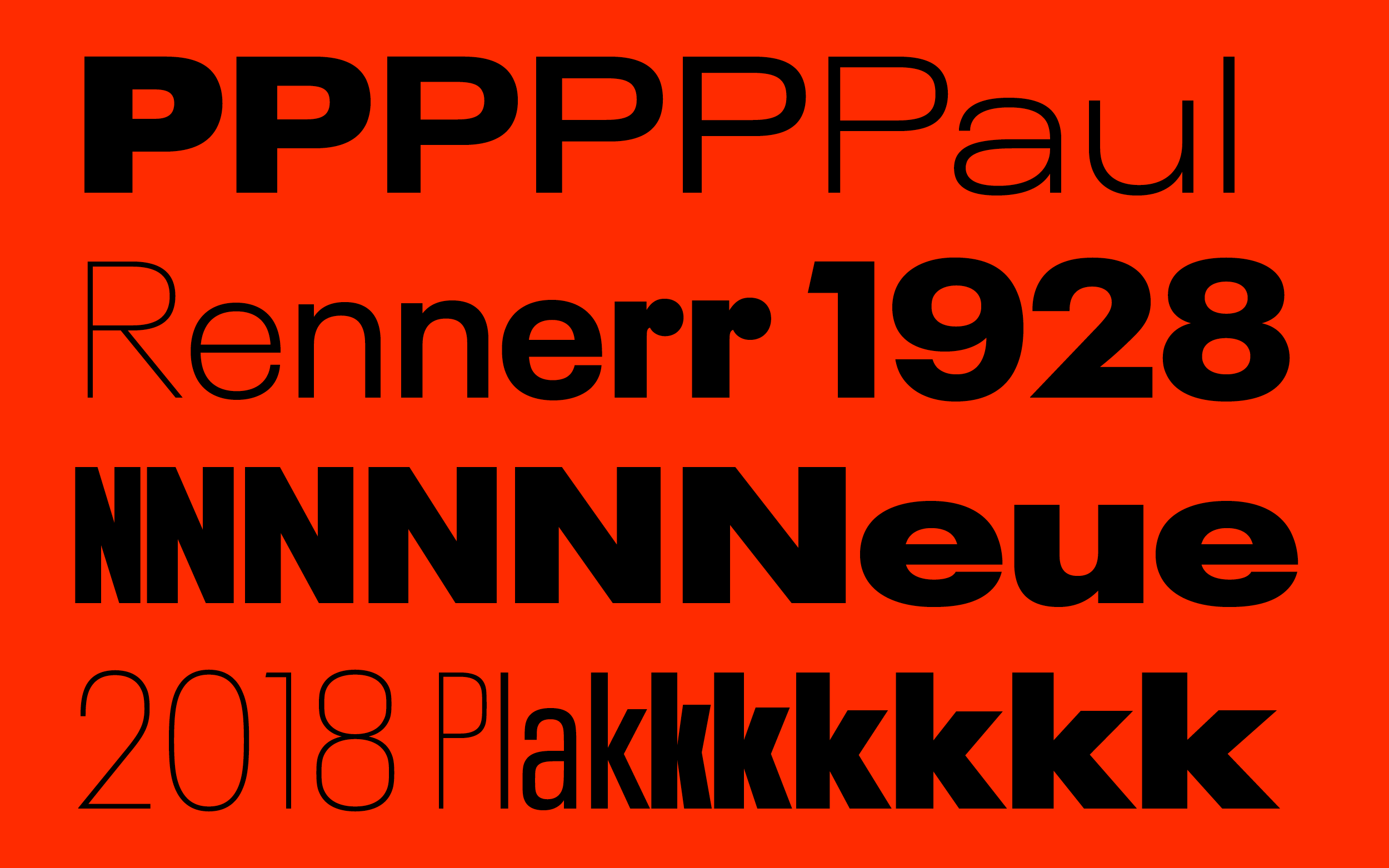
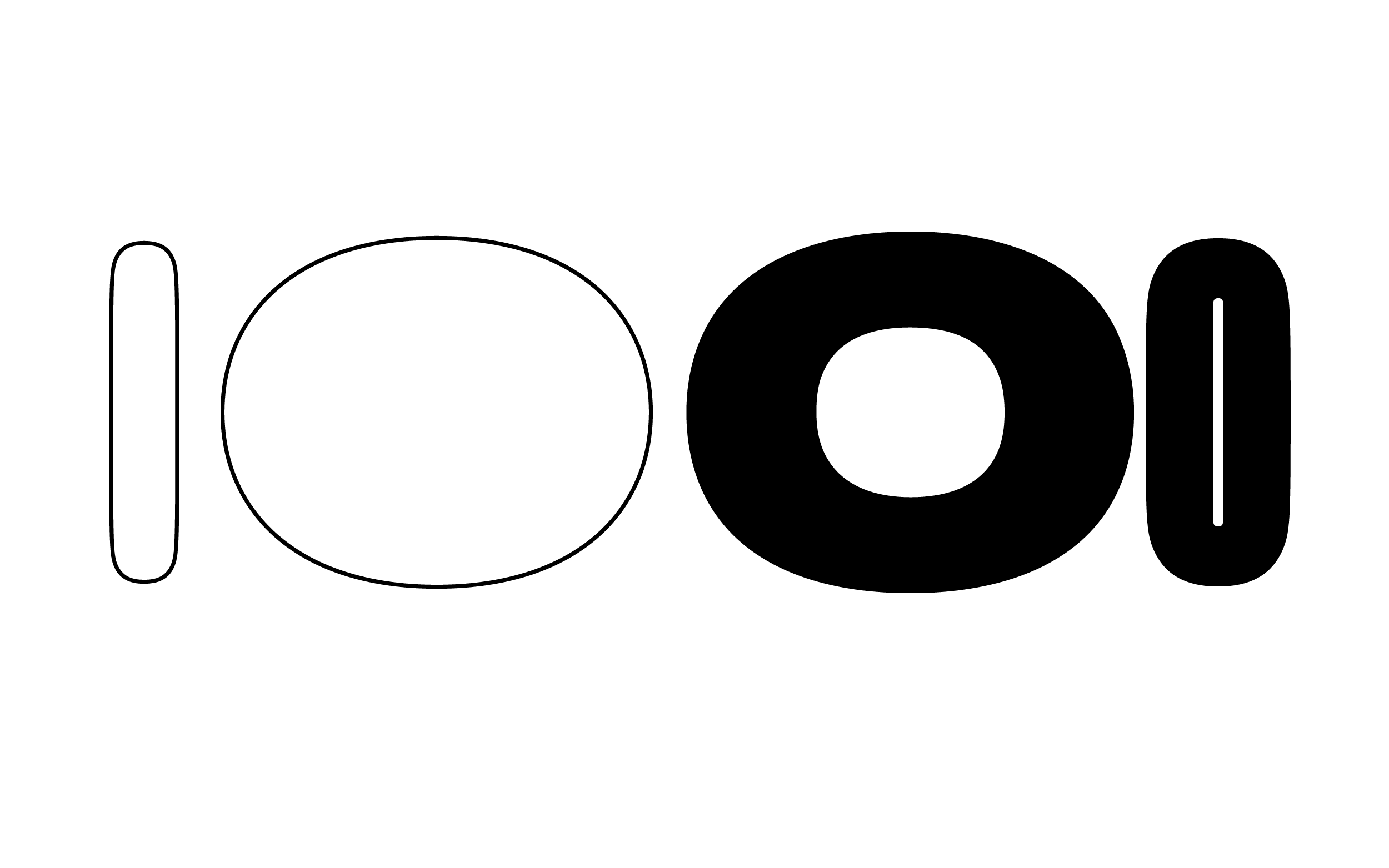
We tried to keep the blend of a certain German stiffness in mechanical drawings with the quirky details it came with, for example the very iconic lowercase r and the many size specific differences in R.
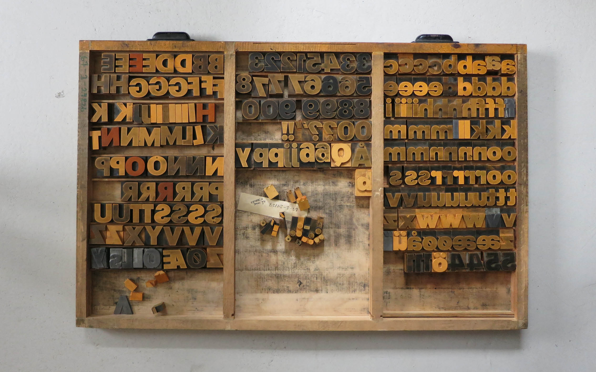
The Museum der Arbeit in Hamburg holds the original wood matrices from Germany's last woodtype manufacturer Gedi-Schriften (basically their entire archive) in one of their ware houses.
We found a version produced in Plakadur (120 and 150pt Fette Plak) ready to print at the printworkshop at the Royal Danish Academy in Copenhagen.
And we had a chance to see it printed at p98a in Berlin.
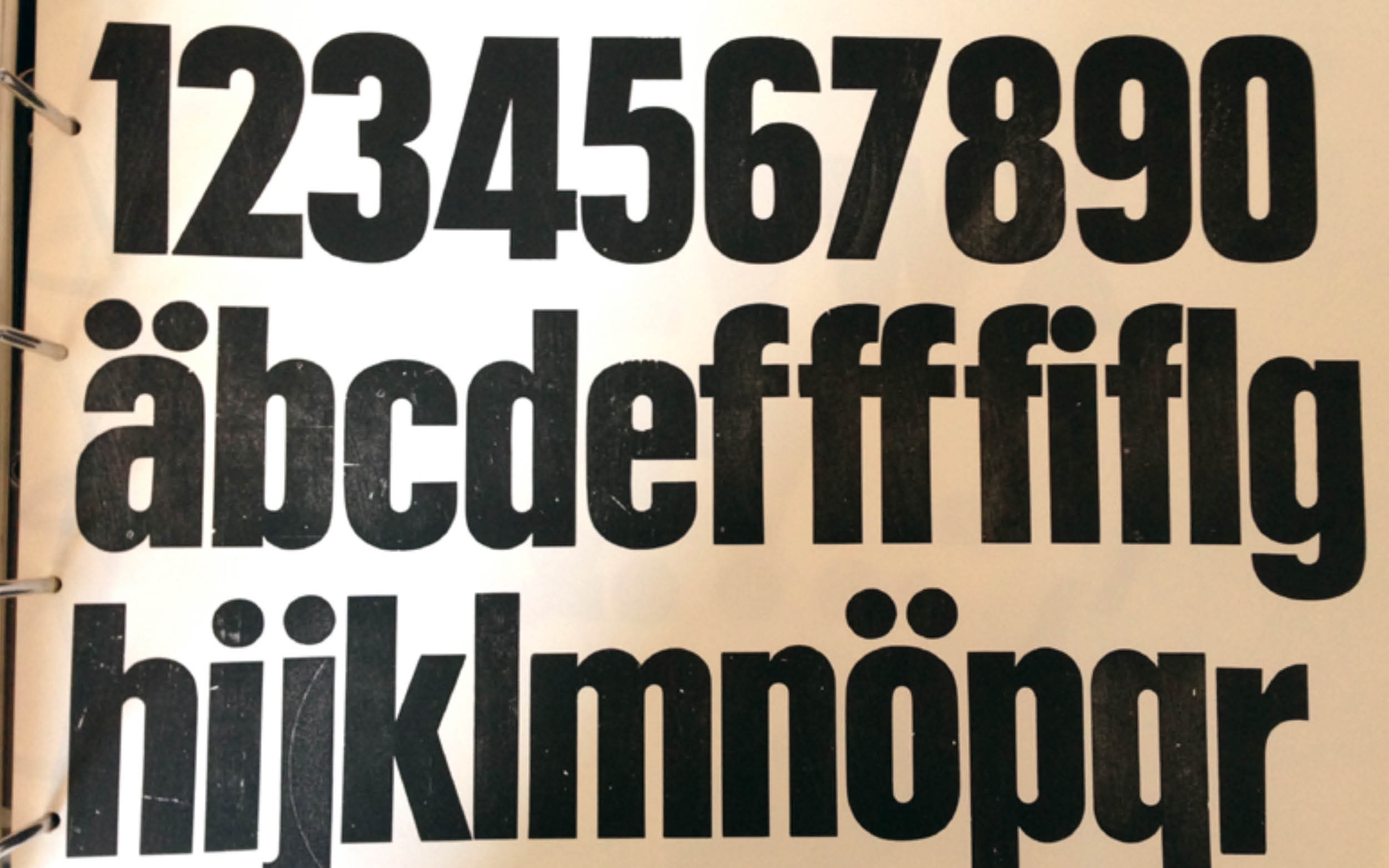
Lastly there was a rather roughly transferred digital version in the Linotype archives (first row), that we tried to compare to our new design, too. Letters like L, T and J had been extremely shortened in the original version, probably due to the fact that kerning is a tedious thing to do when dealing with wood letters. In the text version we evened out those extremes and added a slanted version.
To make the entire family fully interpolatable (also in preparation for it to be published as a variable font), we had to come up with a specific point structure to be able to go from compressed to wide in one go.
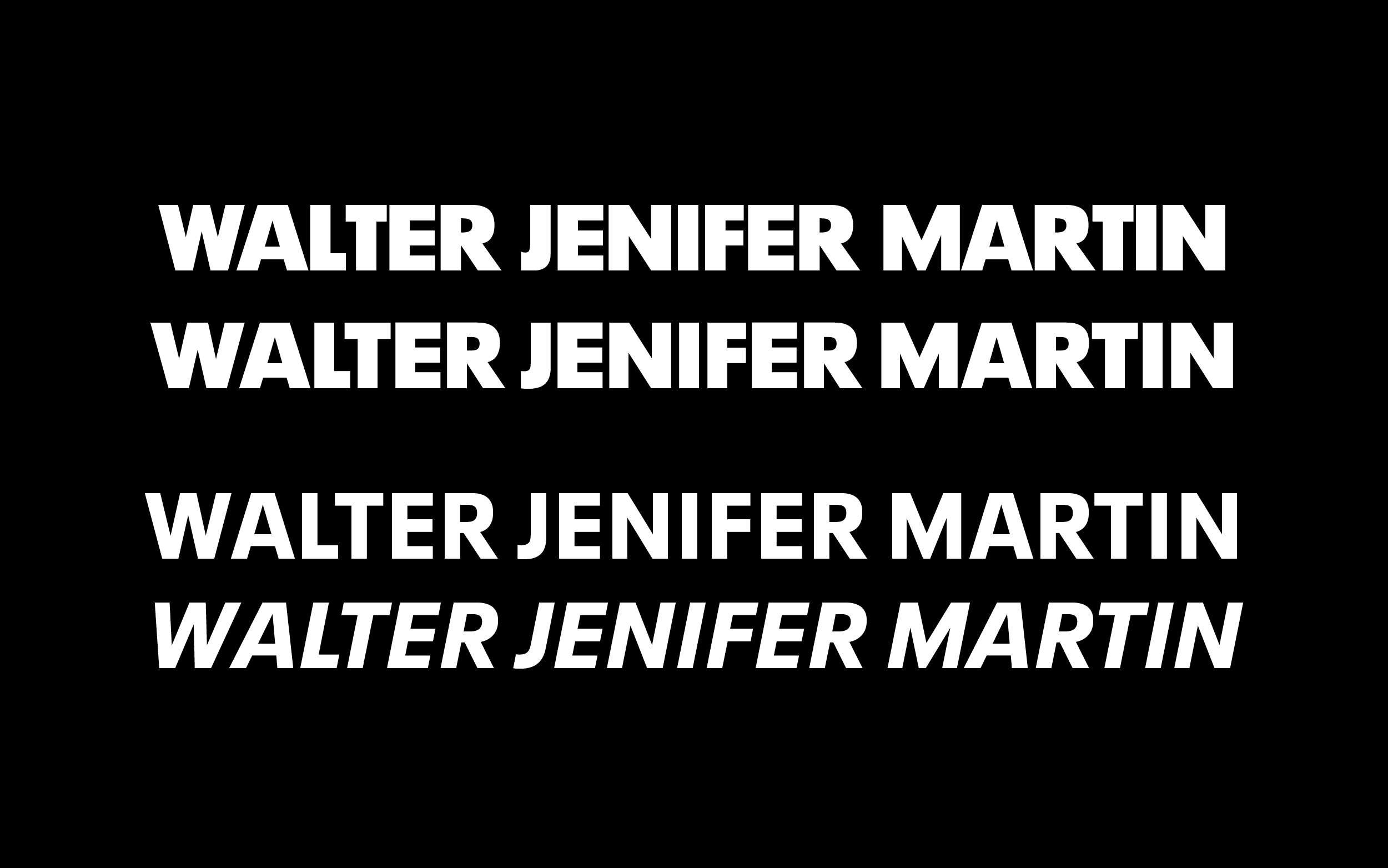
Some text weights and their slanted companions were added, to make the family complete for contemporary needs.
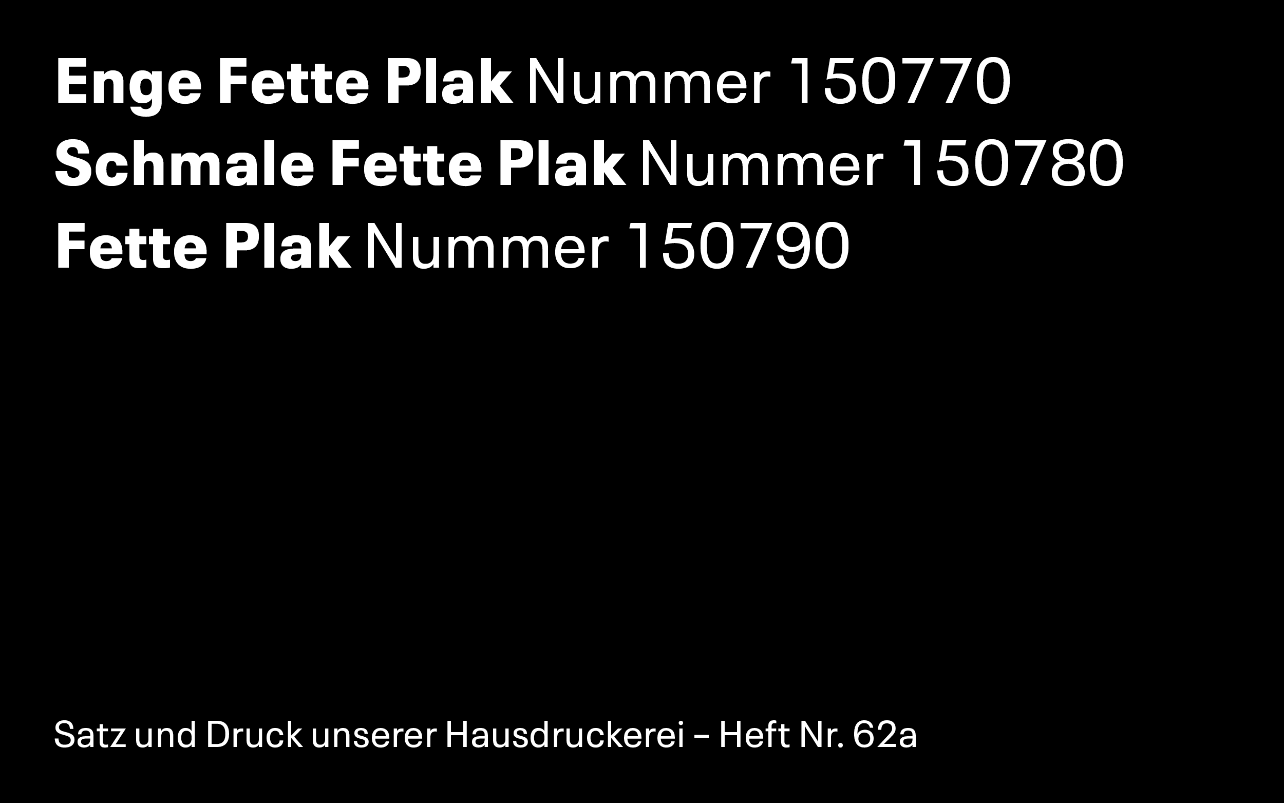
We ended on a large scope of fourtyeight weights drawn in twelve masters considering that it started with three basic styles. Those are still present in the revival together with all the small uniquenesses.
None of us would have taken the project as far as this alone. I would probably not have drawn a Wide Hairline while Toshi was not so keen on the Extra Black weights. We worked as what Toshi described "co-pilots" from the film "Pacific Rim". We split the work, bounced it back and forth, discussed, found solutions. We even kerned the same master independently for an afternoon to see if we had the same approach before we headed out to finish off the family.

Neue Plak
Collaboration with Toshi Omagari
Retail typeface for Monotype
Published 2018